Don't Just Put a <div> on It—Use the Power of the Browser!
The best HTML elements you never knew existed, so you can improve your website's accessibility, mobile UX, and SEO while writing less code.
August 15, 2019 • 6791 words • 24 minute read
Adapted from a talk given at EmberCamp 2019. Original slides and more information on the Talks page.
The humble <div> is a powerful and flexible element. Throw enough CSS and JavaScript on it, and a <div> can be anything. But should it be?
“Semantic HTML” is a method of using elements that best match what your content means and does. But how do you write better markup if you don’t know your options?
Join the learning journey to fill your semantic HTML toolkit with the coolest elements you never knew existed. Learn specific elements to use in different scenarios and how to wield the full power of the HTML spec.
You’ll write less code while making your pages more accessible and mobile-friendly!
Slide with title “Don’t Just Put a <div> On It! User the Power of the Browser”, with attribution to @MarieChatfield.
Introduction to Semantic HTML
Slide with title “Semantic HTML” and subtitle “What is it? Why does it matter?”
You may have heard the phrase or idea that Semantic HTML is better for accessibility
—but what does that mean?
What is it?
That’s still pretty abstract, so it might be easier to consider what non- semantic HTML looks like.
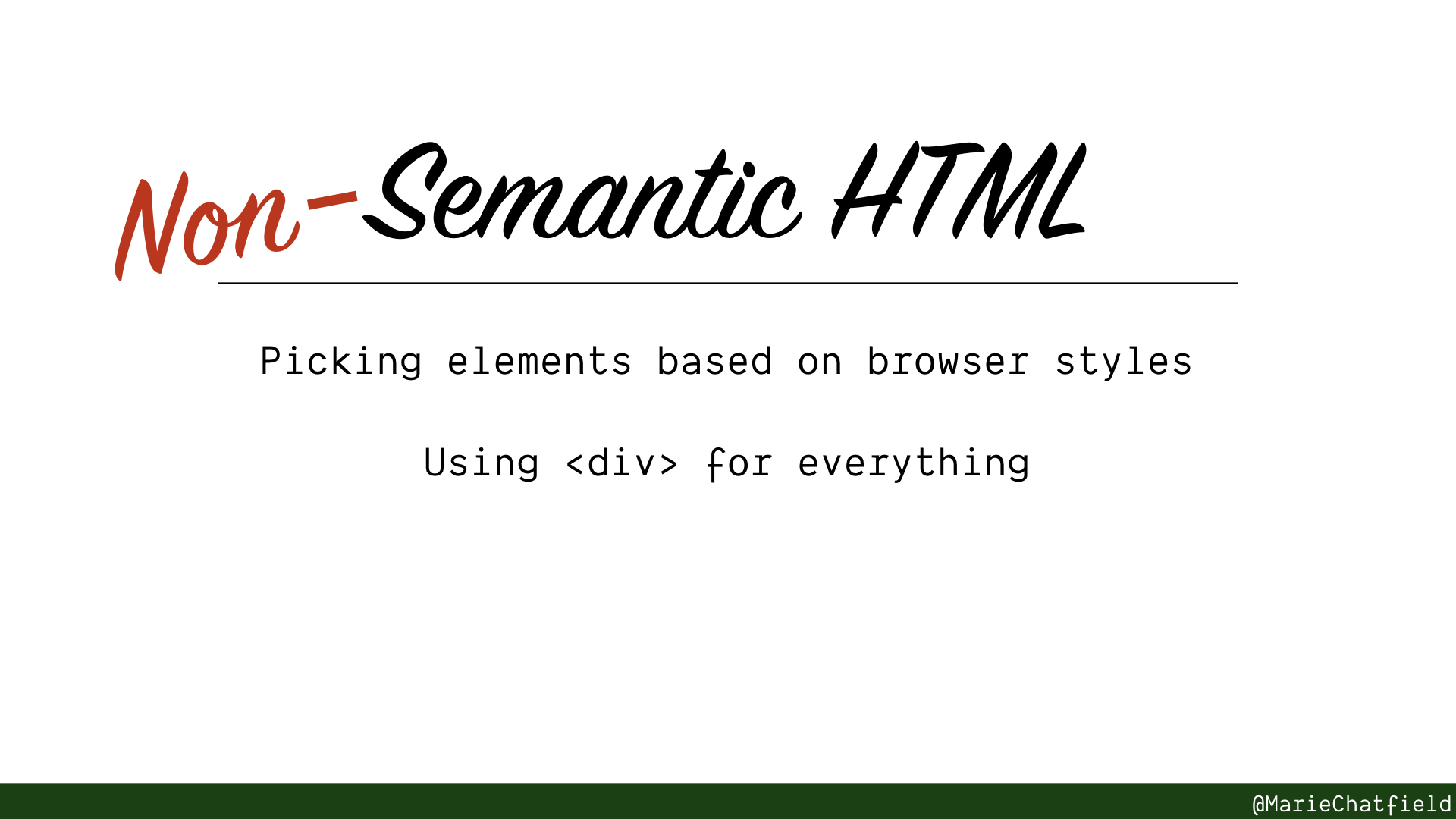
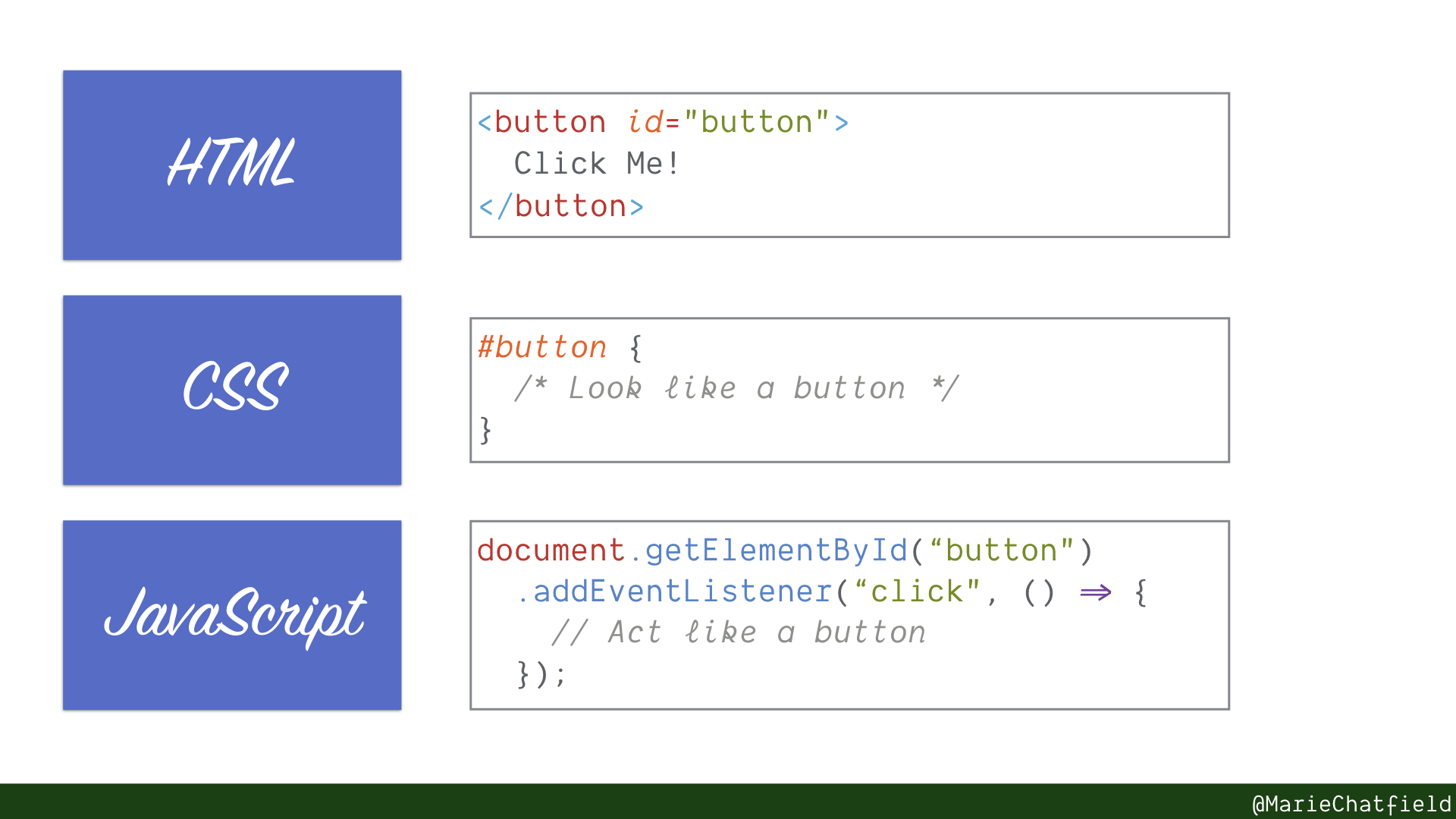
Let’s look at an example of using <div> elements in a non-semantic manner.
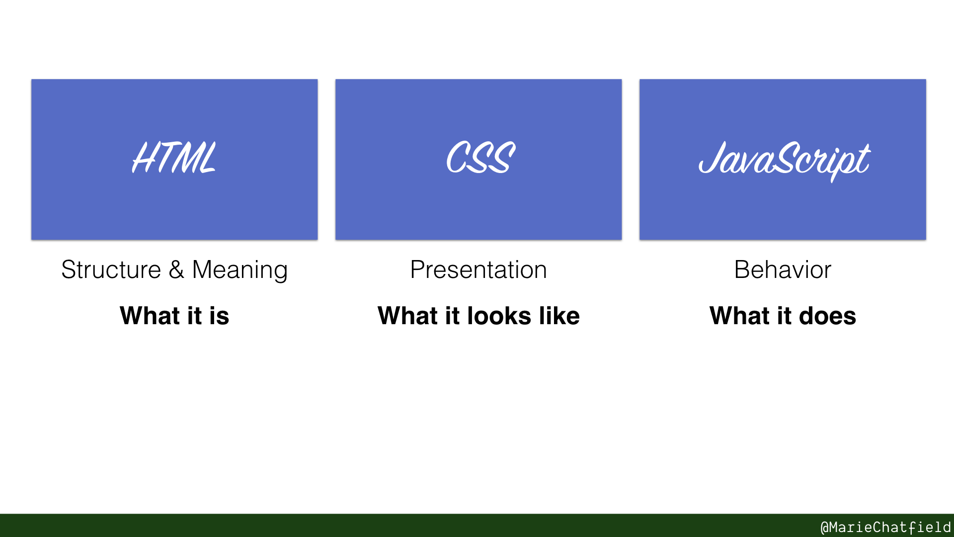
The foundational web technologies are incredibly powerful.
- HTML communicates the structure and meaning of our website, or what it is.
- CSS handles the presentation, or what it should look like.
- JavaScript adds behavior, or what the website does.
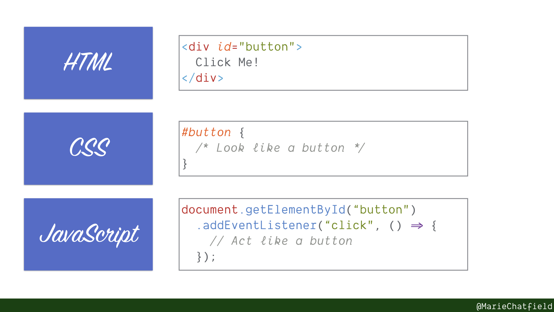
With HTML, we can use a <div> with some content that instructs the user to click it.
With CSS, we can make our <div> look like a button.
With JavaScript, we make our <div> do interesting things when it is clicked, like a button.
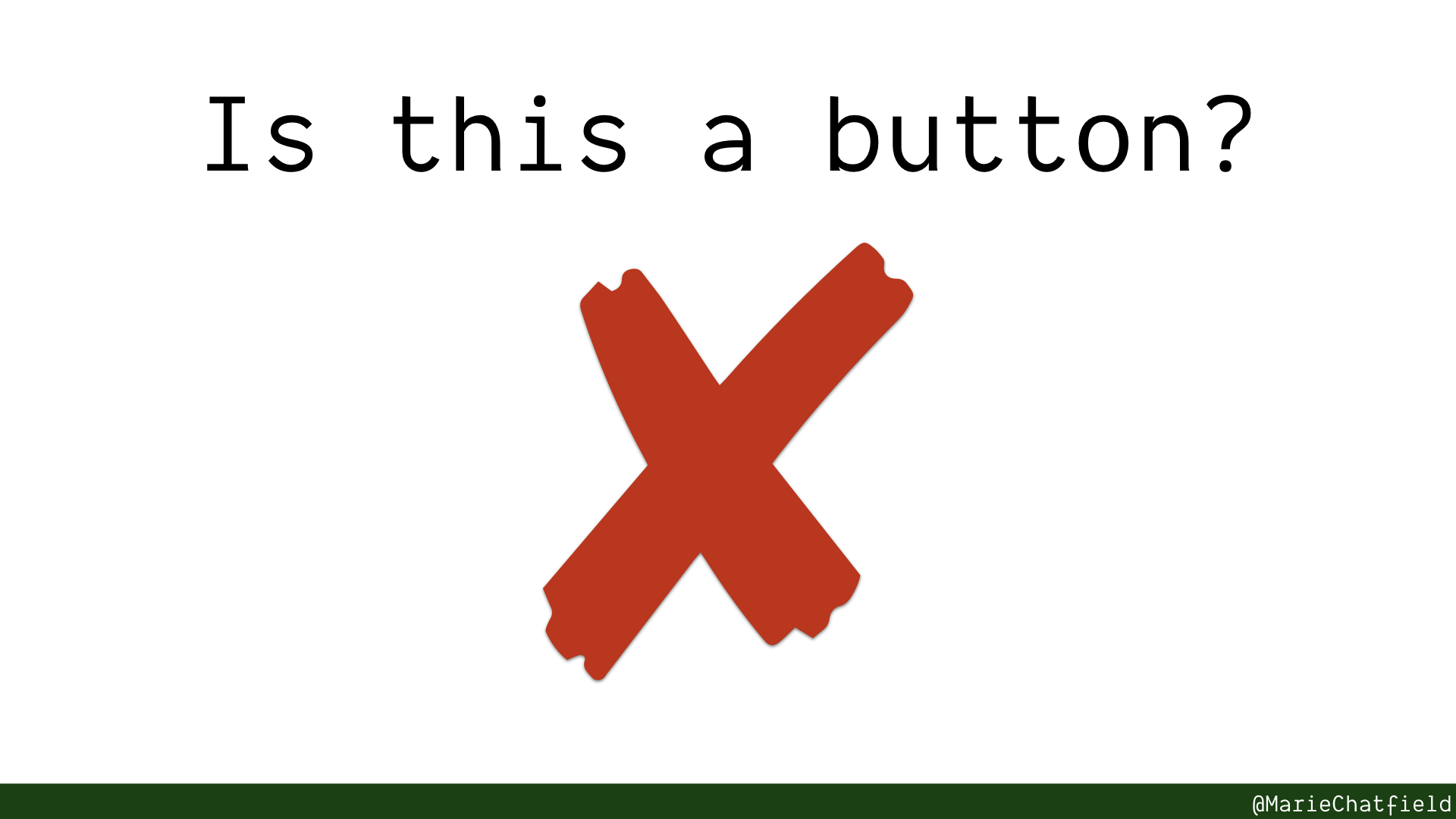
This “button” probably doesn’t handle all the different use cases a real <button> does—it might not support keyboard events, it might not submit forms, it might not display different visual styles on hover.
We could always write all of that code ourselves… but someone already has. In your browser. When we use a <button> element, we get all of that functionality for free.
Why does it matter?
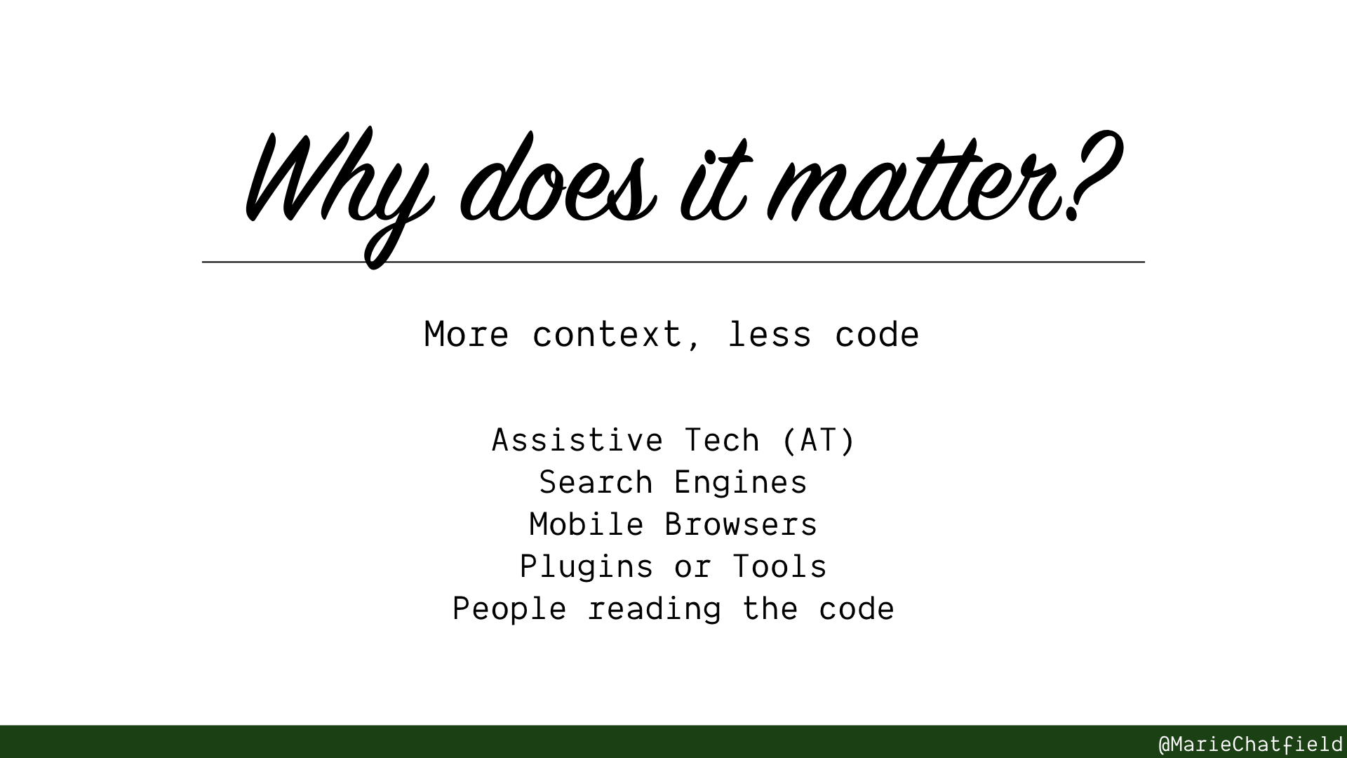
Providing context in your actual HTML means that anyone or anything that uses your code will be able to understand it better, and make better choices accordingly.
-
Assistive Tech (AT) like screen readers can provide people who use them with more precise information about the structure of your site, the state of any data, and ability to navigate more easily.
-
Search Engines indexing your site can determine the unique and relevant information on your page, which can improve your Search Engine Optimization (SEO) and ranking.
-
Mobile Browsers are better able to provide a user experience (UX) that is targeted at smaller screens. For example, bringing up a dedicated keyboard based on the type of text that will be input, or showing native interactive elements that are familiar to users and appropriately sized.
-
Plugins or Tools that use your site can better determine what to show. For example, many browsers offer a Reader Mode to show text in a simple format. Or browser extensions that save a website may be better able to extract interesting and relevant content.
-
People reading the code (whether yourself or someone else) can more easily understand the meaning and context of a page.
Getting Started
So all of this semantic HTML stuff seems great…

Gif of Charles from Brooklyn 99 TV show nodding and saying “Sure sure sure, cool cool cool cool cool.” (source)
…but what if you don’t even know how to start writing it?

Gif of Hannah Brown from The Bachelorette TV show looking frustrated and saying “I don’t even know where to start” (source)
That’s why we’re going to learn all about a bunch of HTML elements that you can start using today!
The rest of this post goes over a few categories of HTML elements. You’ll see a preview of the same site written with <div> elements and in semantic HTML, with side-by-side comparisons of how it behaves in different scenarios.
Embedded semantic-html-examples Glitch app.
Skip to Section:
Warning: Many of these elements are part of the HTML5 specification. They may not be consistently supported across all browsers, but I have largely tried to pick examples that work in Internet Explorer, Edge, Firefox, Safari, and Chrome.
You should still do your own cross-browser functionality research and testing before implementing any of these elements yourself!
Document Structure
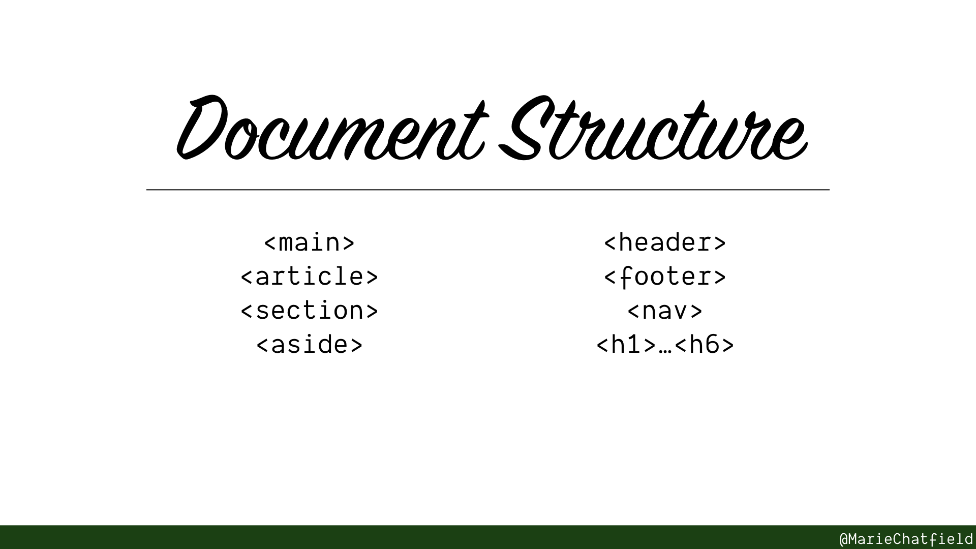
Document Structure section slide, with HTML elements <main>, <article>, <section>, <aside>, <header>, <footer>, <nav>, and <h1>…<h6>.
Elements used to outline the general shape and contents of your website.
Communicate the relative importance of different sections of content. Improve accessibility, search engine optimization, and accuracy of tools like reader modes.
Side by Side Preview
Let’s look at a sample blog post page, implemented using mostly <div> elements, and implemented using semantic HTML.
You can see the source code yourself, or edit a copy of it, using this Glitch app.
Let’s compare how these two sides stack up across a couple of different ways of accessing them.
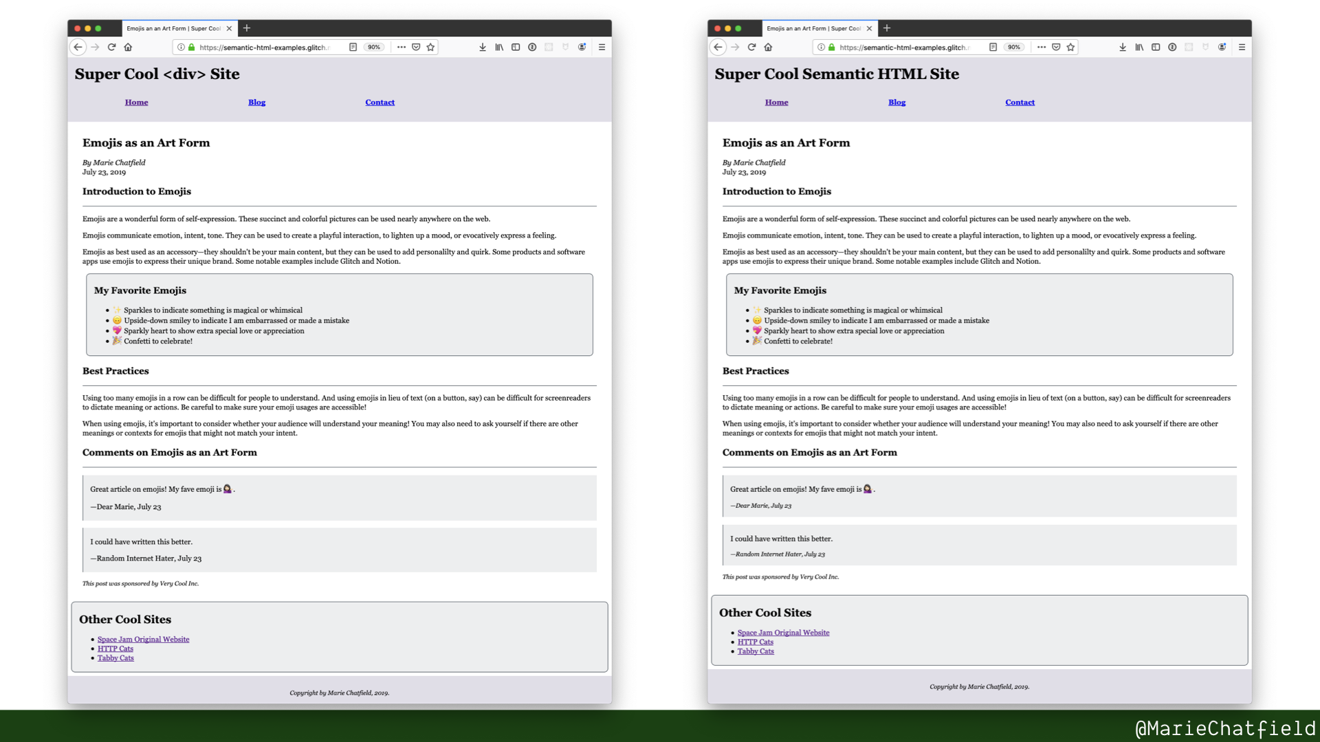
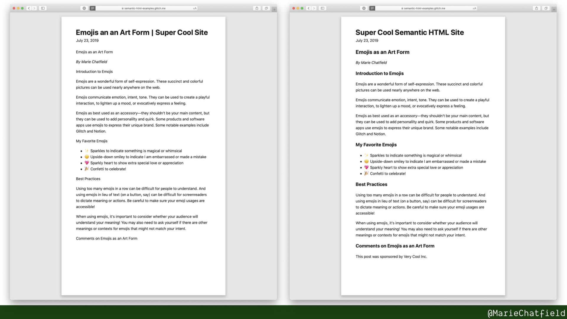
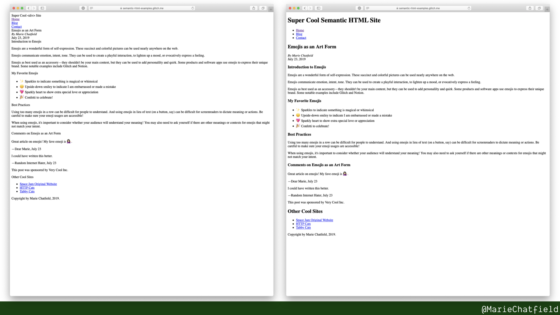
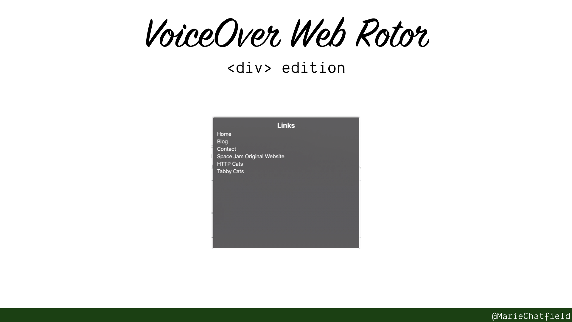
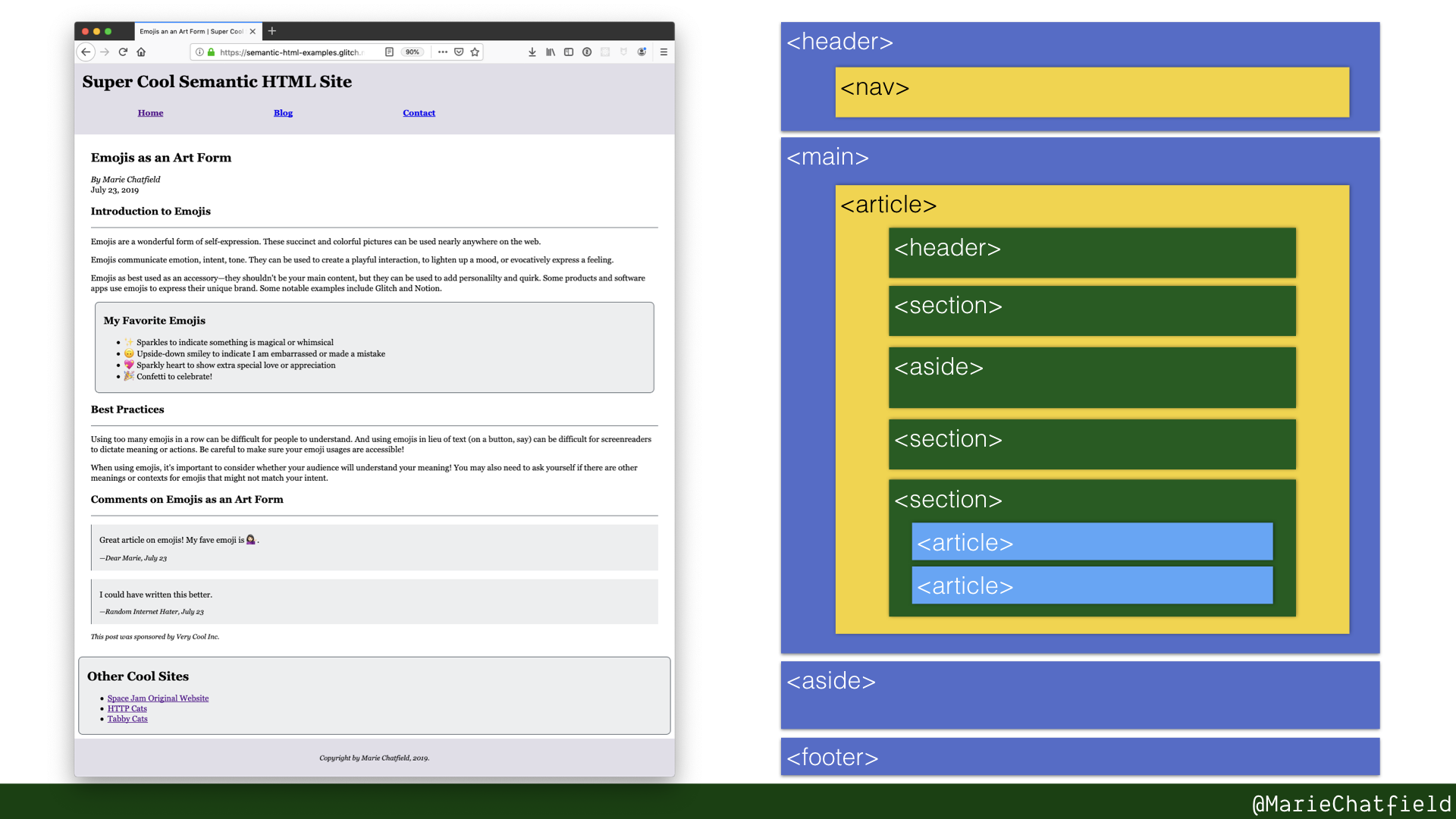
Here are the HTML elements that make up this page.
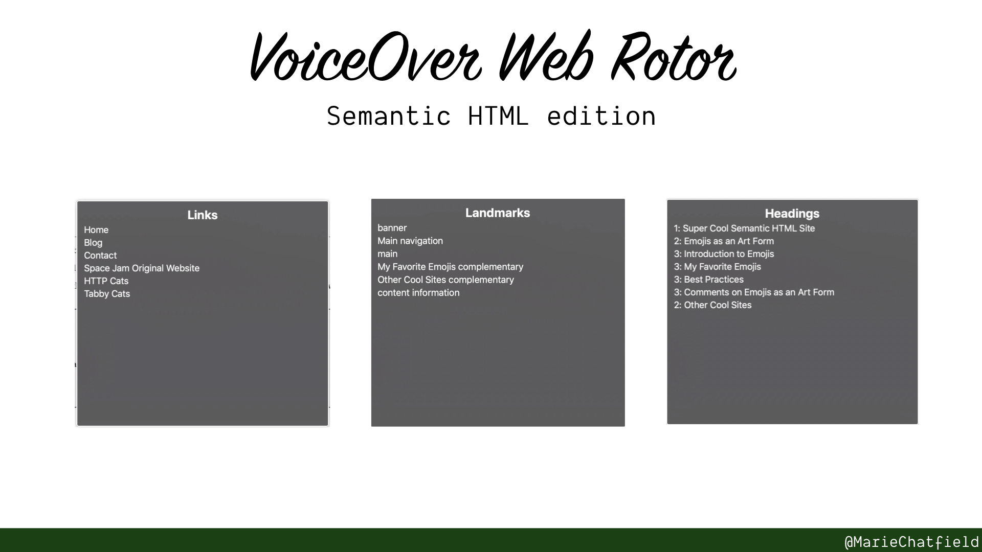
Skip to Section:
General Resources:
- Web Accessibility Tutorials: Page Regions, W3C WAI
- ARIA Landmarks Example, W3C WAI
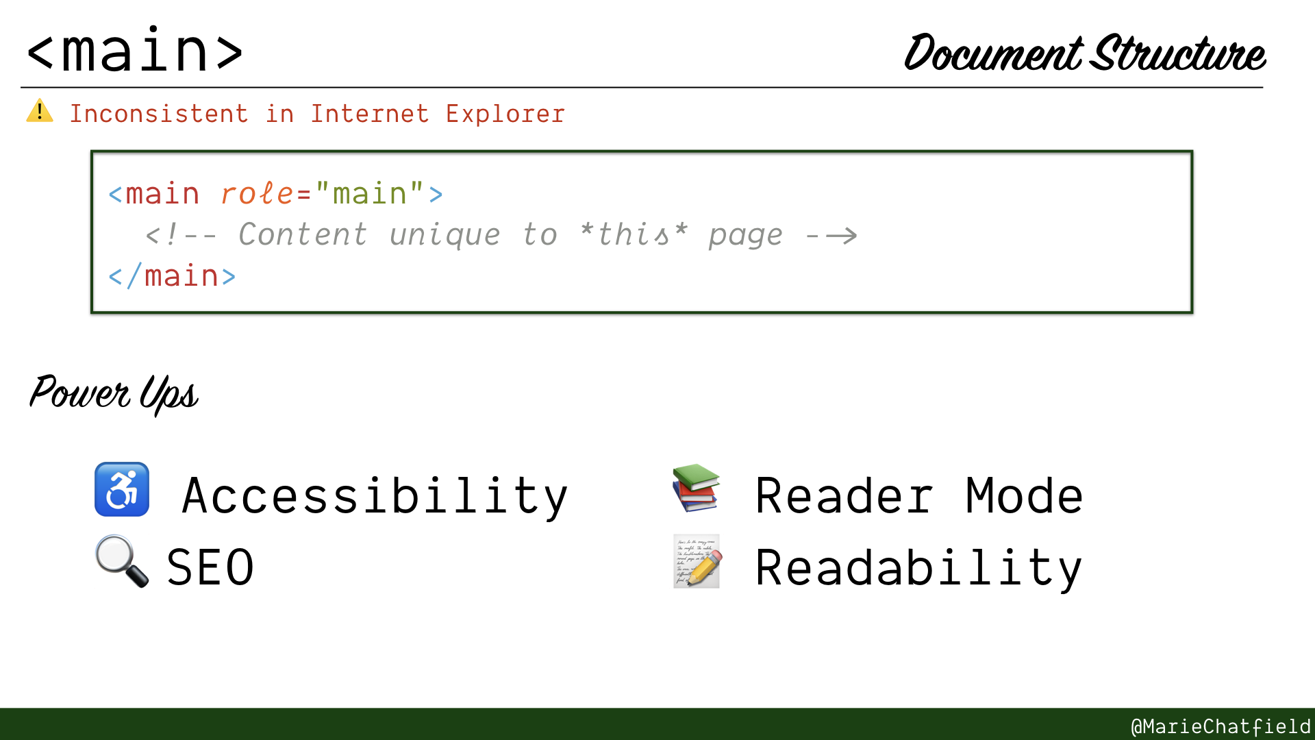
<main> element details slide, with code sample and power ups.
<main>
Warning: Inconsistent in Internet Explorer
- Primary content of this page, what is unique
- Only one per page!
- Comes with
mainARIA landmark role (except in IE)
Code Sample
<main role="main">
  <!-- Content unique to *this* page -->
</main>
Power Ups
- ♿ Accessibility
- 🔍 SEO
- 📚 Reader Mode
- 📝 Readability
Resources
- HTML Element: <main>, MDN
- HTML Element: <main>: Skip Navigation, MDN
- The main element, Richard Clark for HTML5 Doctor
- ARIA: Main role, MDN
- Landmark 1:
mainlandmark: at least one, University of Illinois
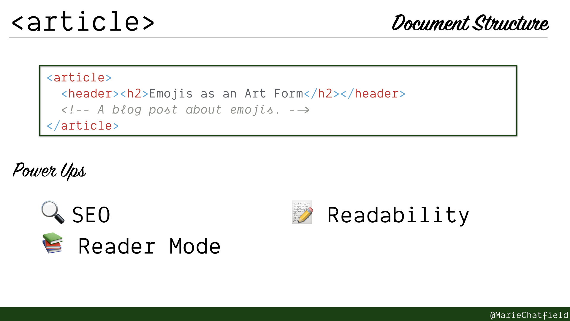
<article> element details slide, with code sample and power ups.
<article>
- Independent, reusable, and complete content (RSS feed test from HTML5 Doctor)
- Should have a heading to identify
- Can be nested to show related content
Code Sample
<article>
  <header><h2>Emojis as an Art Form</h2></header>
  <!-- A blog post about emojis. -->
</article>
Power Ups
- 🔍 SEO
- 📚 Reader Mode
- 📝 Readability
Resources
- HTML Element: <article>, MDN
- The article element, Tom Leadbetter for HTML5 Doctor
- How To Correctly Use Semantic HTML5 <article>, <main> and <section> Tags, Dwayne Charrington of I Like Kill Nerds
- Building websites for Safari Reader Mode and other reading apps, Mandy Michael on Medium
- The SEO Advantages of Machine-Readable HTML5 Semantic Markup, Detlef Johnson for Search Engine Land
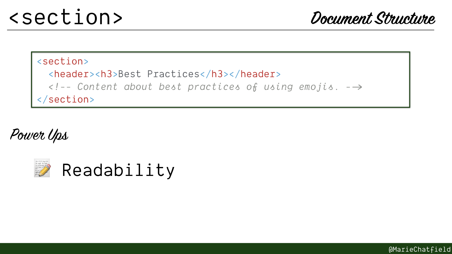
<section> element details slide, with code sample and power ups.
<section>
- Logical piece of content
- Typically have a heading to identify
- If you can’t think of a heading, it’s probably not a <section> (not arbitrary)
Code Sample
<section>
  <header><h3>Best Practices</h3></header>
  <!-- Content about best practices of using emojis. -->
</section>
Power Ups
- 📝 Readability
Resources
- HTML Element: <section>, MDN
- How To Correctly Use Semantic HTML5 <article>, <main> and <section> Tags, Dwayne Charrington of I Like Kill Nerds
- Building websites for Safari Reader Mode and other reading apps, Mandy Michael on Medium
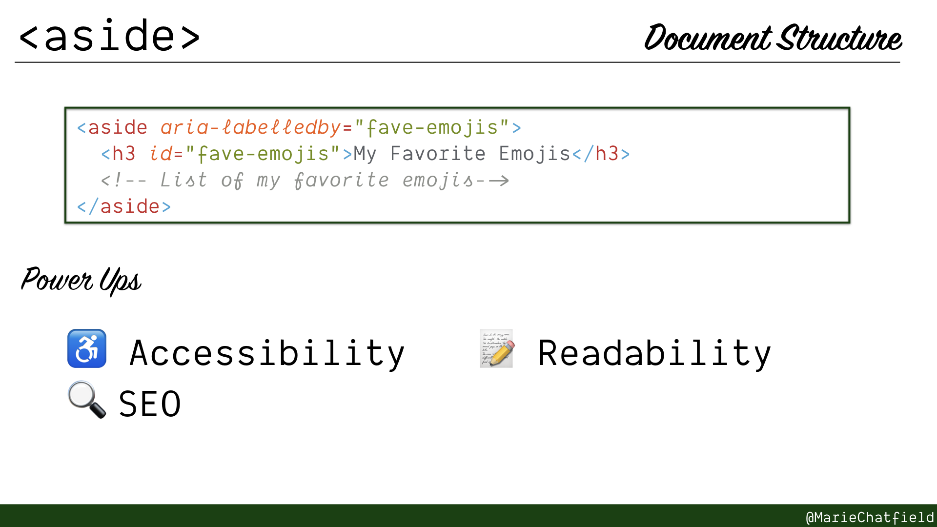
<aside> element details slide, with code sample and power ups.
<aside>
- Logical piece of content that is indirectly related to parent content
- Comes with “complementary” ARIA landmark role
- Not always a sidebar! Could be something like an info block within a blog post
Code Sample
<aside aria-labelledby="fave-emojis">
  <h3 id="fave-emojis">My Favorite Emojis</h3>
  <!-- List of my favorite emojis-->
</aside>
Power Ups
- ♿ Accessibility
- 🔍 SEO
- 📝 Readability
Resources
- HTML Element: <aside>, MDN
- ARIA: Complementary role, MDN
- Aside Revisted, Mike Robinson for HTML5 Doctor
- Sidebar and Aside are different! by Aurélien Aries
- Landmark 17: Landmarks must be uniquely identifiable, University of Illinois
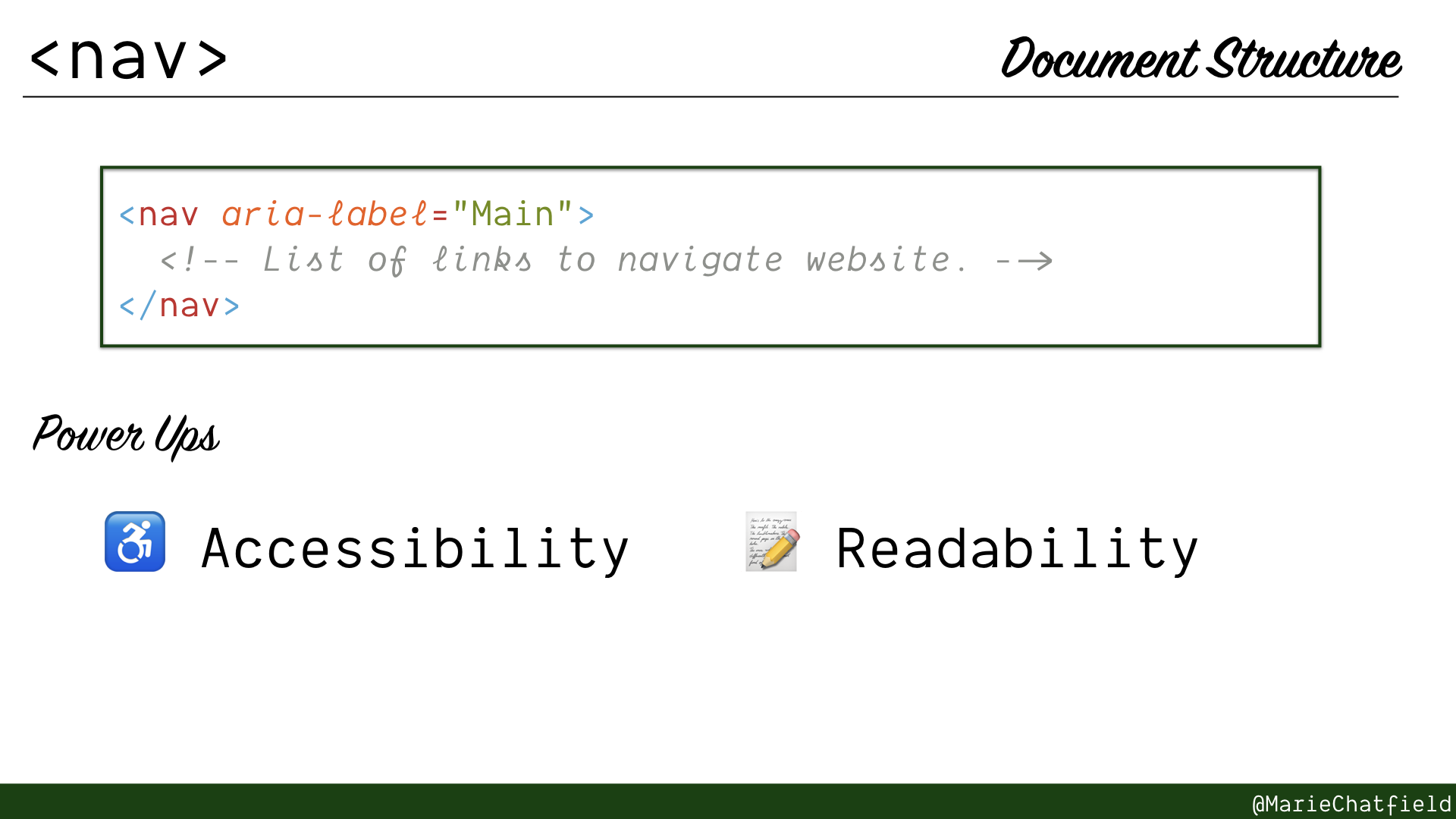
<nav> element details slide, with code sample and power ups.
<nav>
- Important blocks of navigation links (use sparingly!)
- Comes with “navigation” ARIA landmark role
- Should use labels if there are more than one per page
- Not all lists of links should go in a <nav>!
Code Sample
<nav aria-label="Main">
  <!-- List of links to navigate website. -->
</nav>
Power Ups
- ♿ Accessibility
- 📝 Readability
Resources
- HTML Element: <nav>, MDN
- ARIA: Navigation role, MDN
- Web Accessibility Tutorials: Menu Structure, W3C WAI
- Web Accessibility Guidelines: Navigation, Carnegie Museums of Pittsburgh
- Avoiding common HTML5 mistakes, Richard Clark for HTML5 Doctor
- See “Don’t wrap all lists of links in <nav>”
- Landmark 3:
navigationlandmark: at least one, University of Illinois
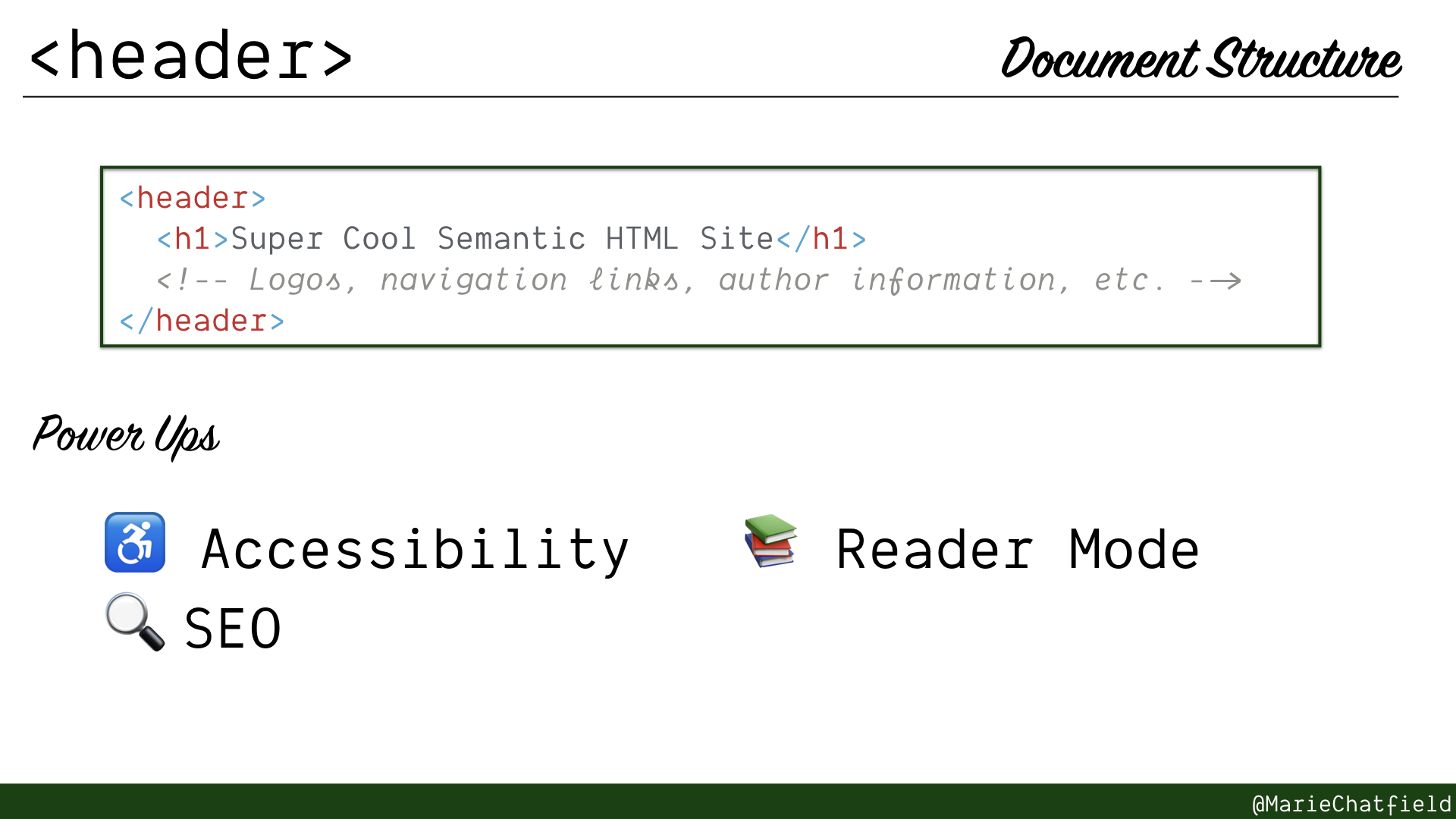
<header> element details slide, with code sample and power ups.
<header>
- Introductory content for its parent element
- Often has ARIA landmark role “banner” if top-level in <body>
- Can be used inside other elements to identify intro content for those (e.g. an <article> header)
Code Sample
<header>
  <h1>Super Cool Semantic HTML Site</h1>
  <!-- Logos, navigation links, author information, etc. -->
</header>
Power Ups
- ♿ Accessibility
- 🔍 SEO
- 📚 Reader Mode
Resources
- HTML Element: <header>, MDN
- ARIA: Banner role, MDN
- Landmark 4:
bannerlandmark: identifies branding content, University of Illinois - Landmark 5:
bannerlandmark: no more than one, University of Illinois - Landmark 8:
bannerlandmark: must be top-level, University of Illinois
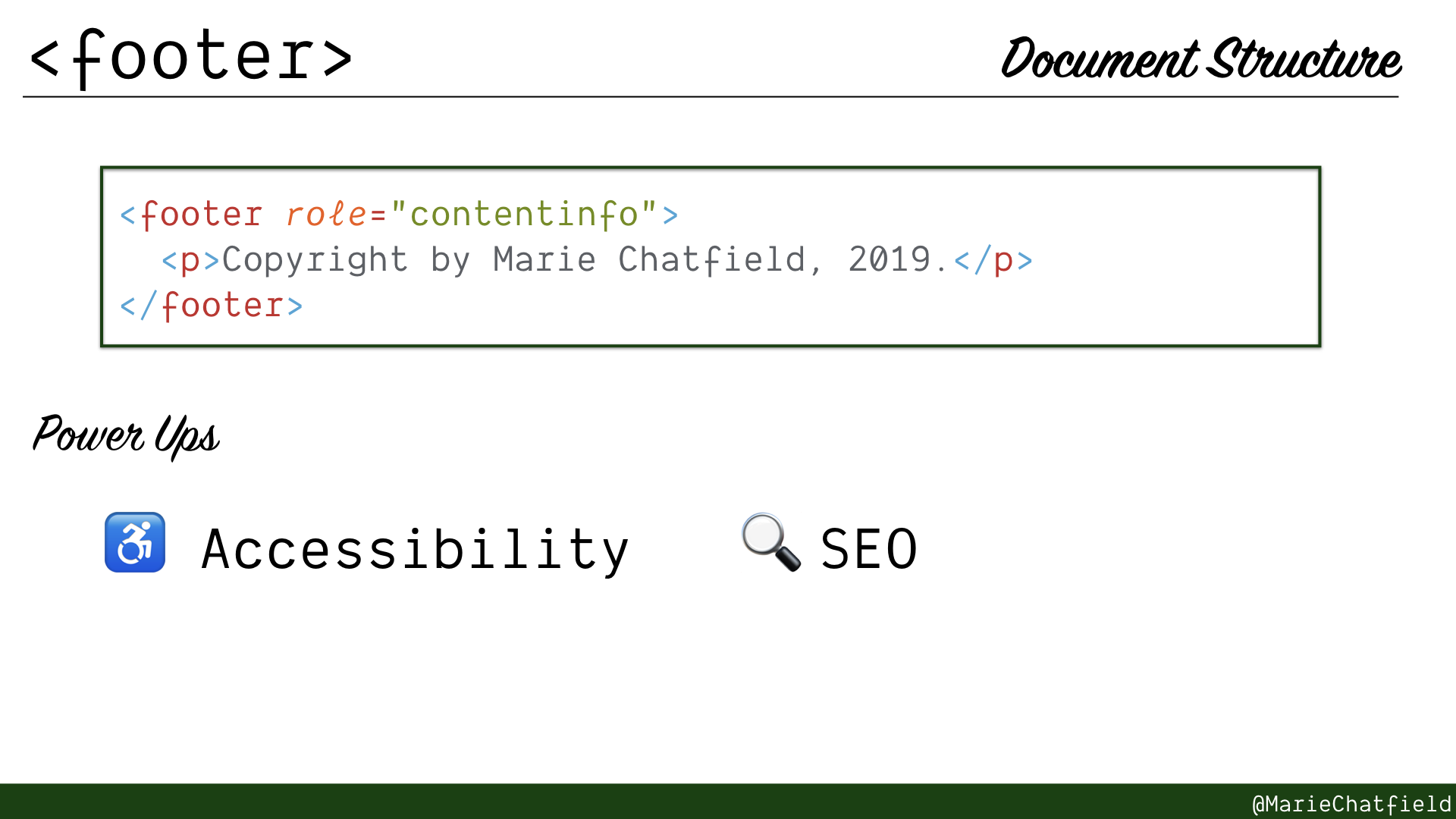
<footer> element details slide, with code sample and power ups.
<footer>
- Informational content for its parent element
- Often has landmark role “contentinfo” if top-level in <body> (except in VoiceOver)
Code Sample
<footer role="contentinfo">
  <p>Copyright by Marie Chatfield, 2019.</p>
</footer>
Power Ups
- ♿ Accessibility
- 🔍 SEO
Resources
- HTML Element: <footer>, MDN
- ARIA: contentinfo role, MDN
- Landmark 6:
contentinfolandmark: identifies admin content, University of Illinois - Landmark 7:
contentinfolandmark: no more than one, University of Illinois
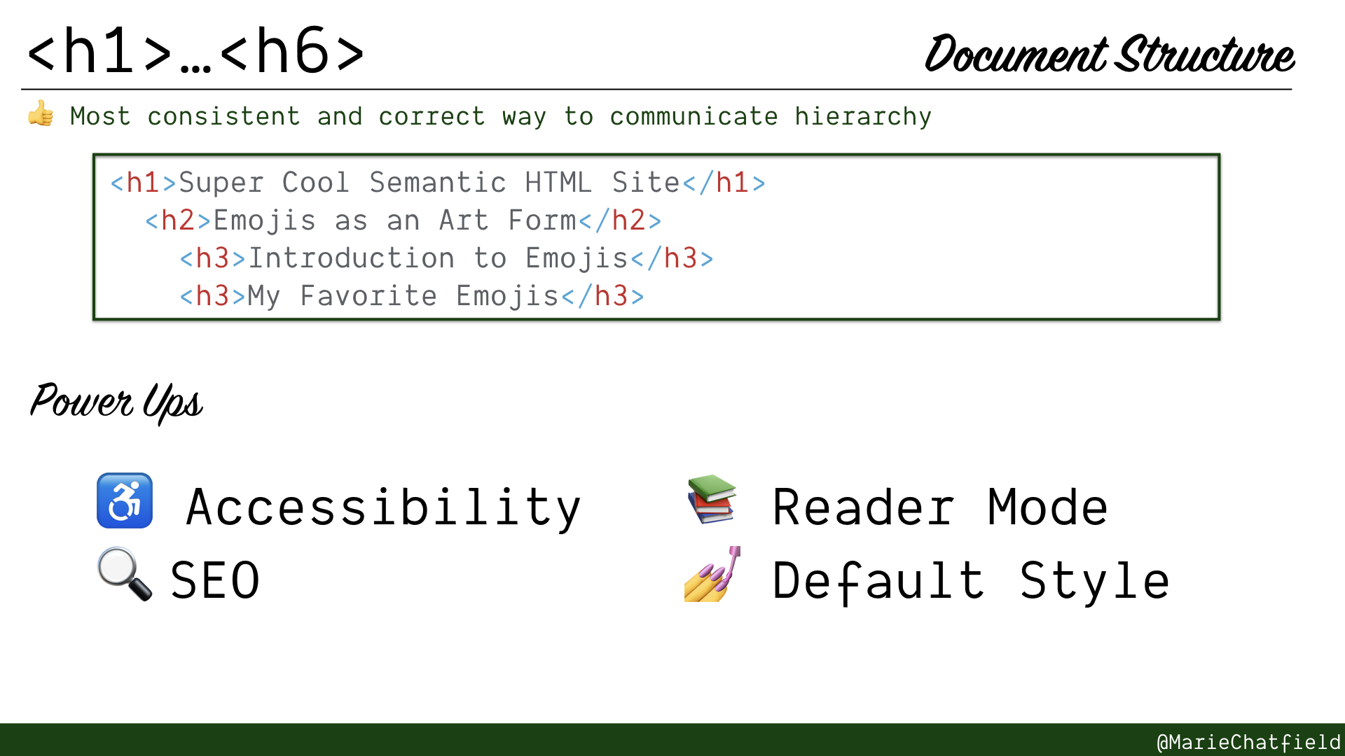
<h1>…<h6> elements details slide, with code sample and power ups.
<h1> … <h6>
- Section headings that split the document into nested groups
- Do not skip! Do not use out of order!
- Only one <h1> per page
- Most consistent and correct method to communicate document hierarchy
Code Sample
<h1>Super Cool Semantic HTML Site</h1>
<h2>Emojis as an Art Form</h2>
<h3>Introduction to Emojis</h3>
<h3>My Favorite Emojis</h3>
Power Ups
- ♿ Accessibility
- 🔍 SEO
- 📚 Reader Mode
- 💅 Default Style
Resources
- <h1>-<h6>: The HTML Section Heading Elements, MDN
- Web Accessibility Tutorials: Headings, W3C WAI
- Web Accessibility Tutorials: Page Structure Concepts, W3C WAI
Forms & Inputs
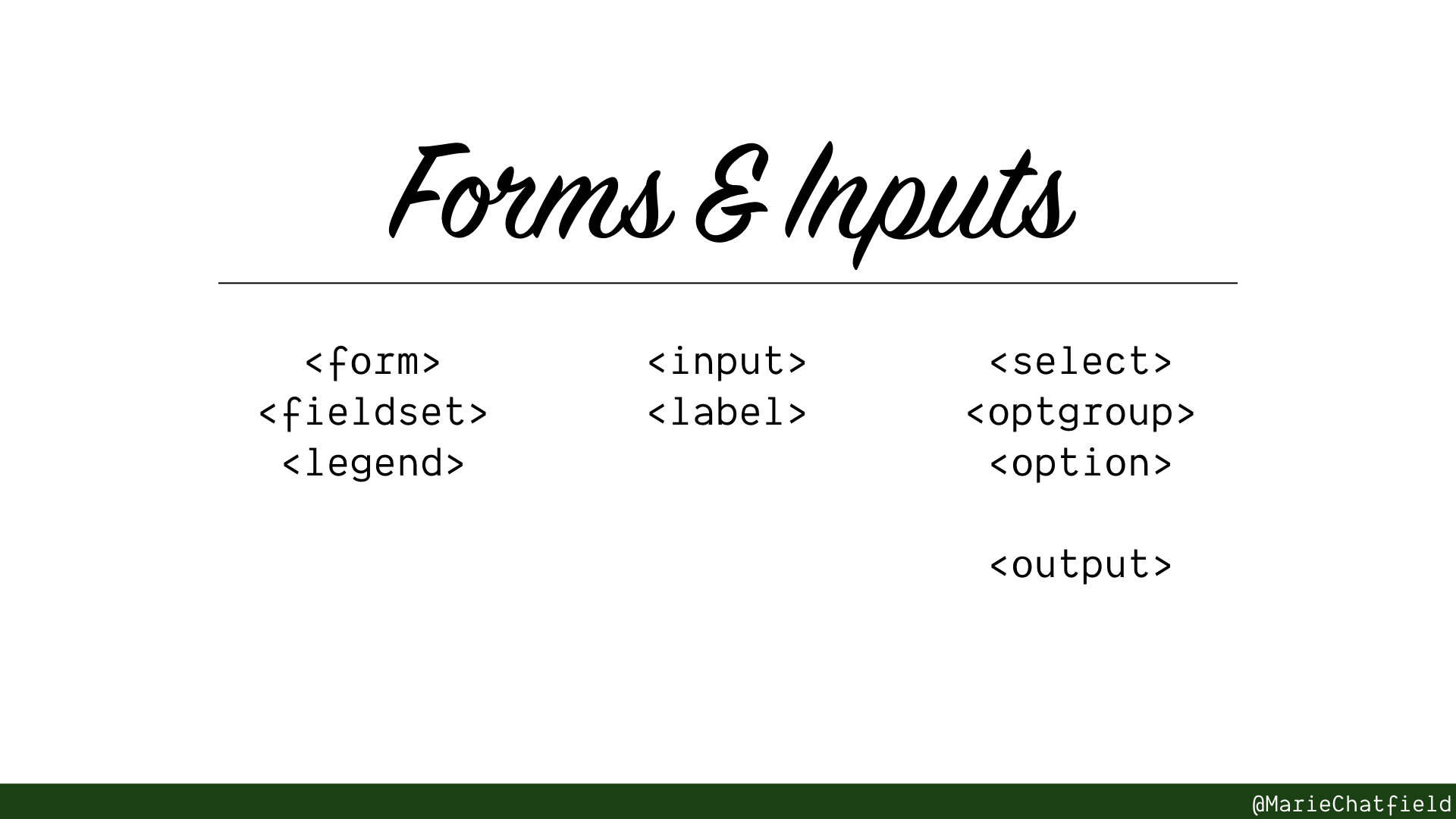
Forms & Inputs section slide, with HTML elements <form>, <fieldset>, <legend>, <input>, <label>, <select>, <optgroup>, <option>, and <output>.
Elements used to provide interactive controls and inputs for users.
Improve accessibility and mobile experience, particularly with more complex input validation.
Side by Side Preview
Let’s look at a sample page that has a form with multiple sections, implemented using mostly <div> elements, and implemented using semantic HTML.
You can see the source code yourself, or edit a copy of it, using this Glitch app.
Let’s compare how these two sides stack up across a couple of different ways of accessing them.
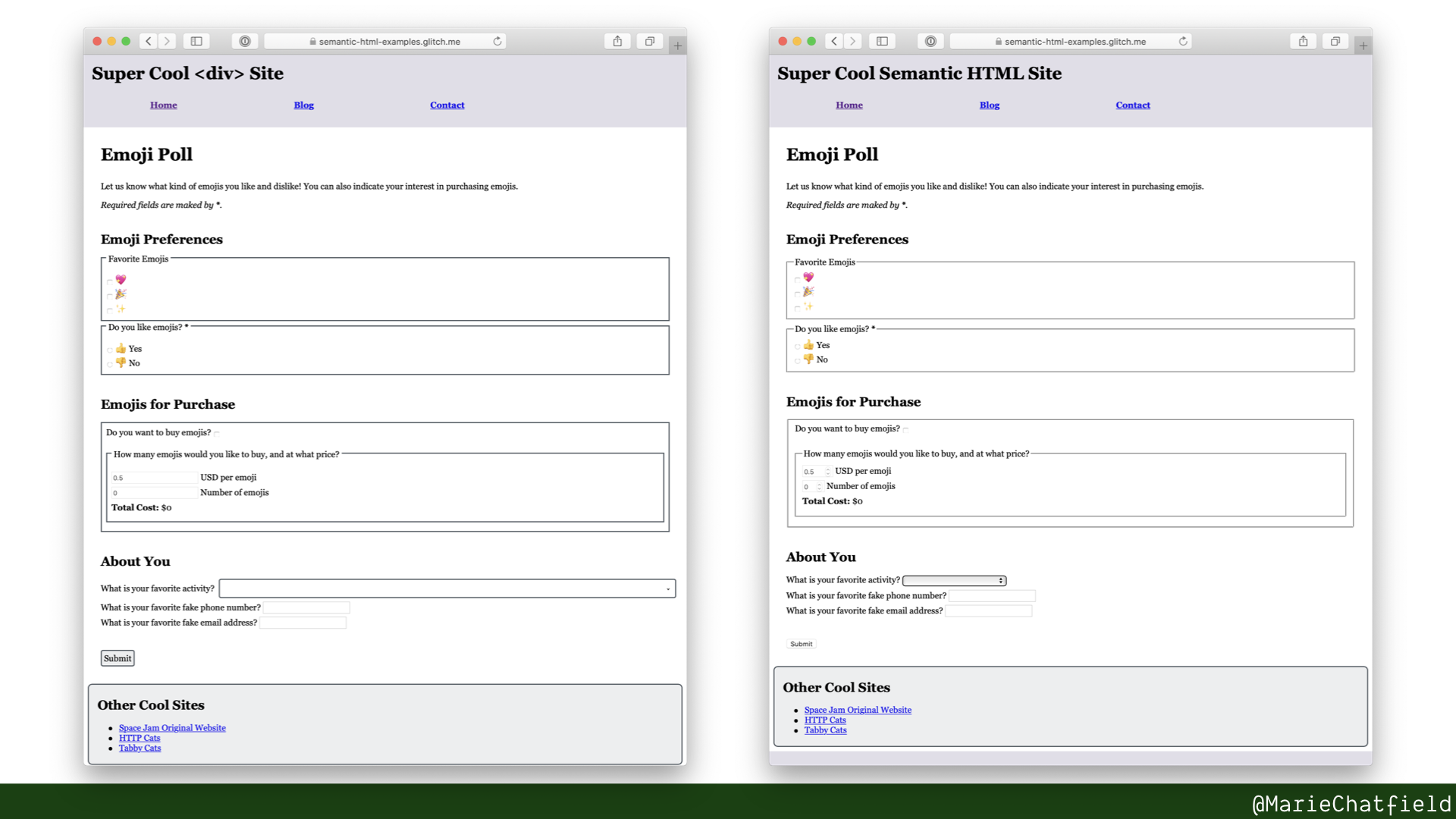
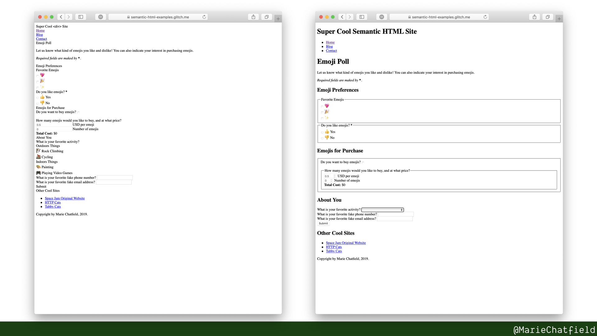

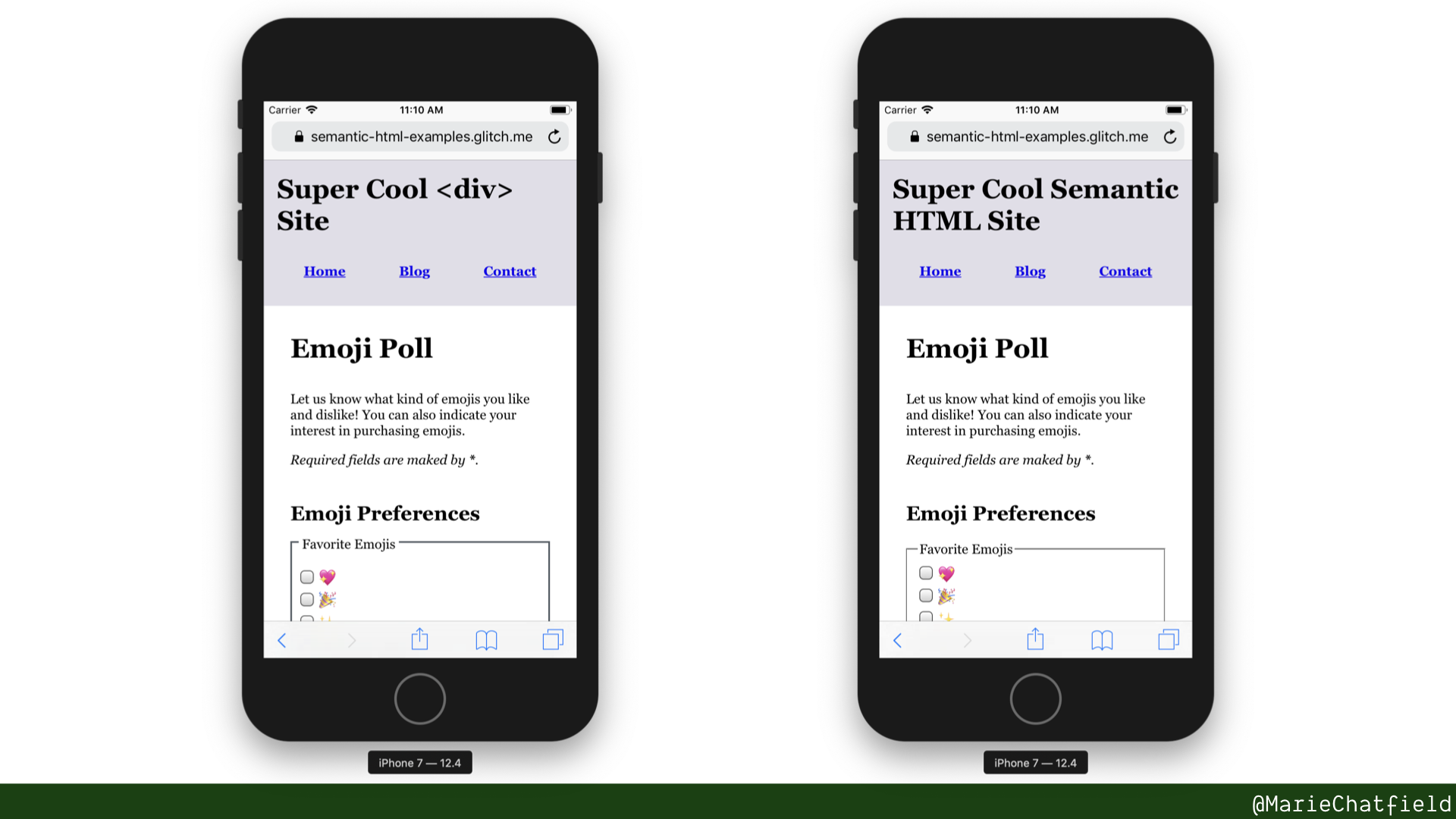
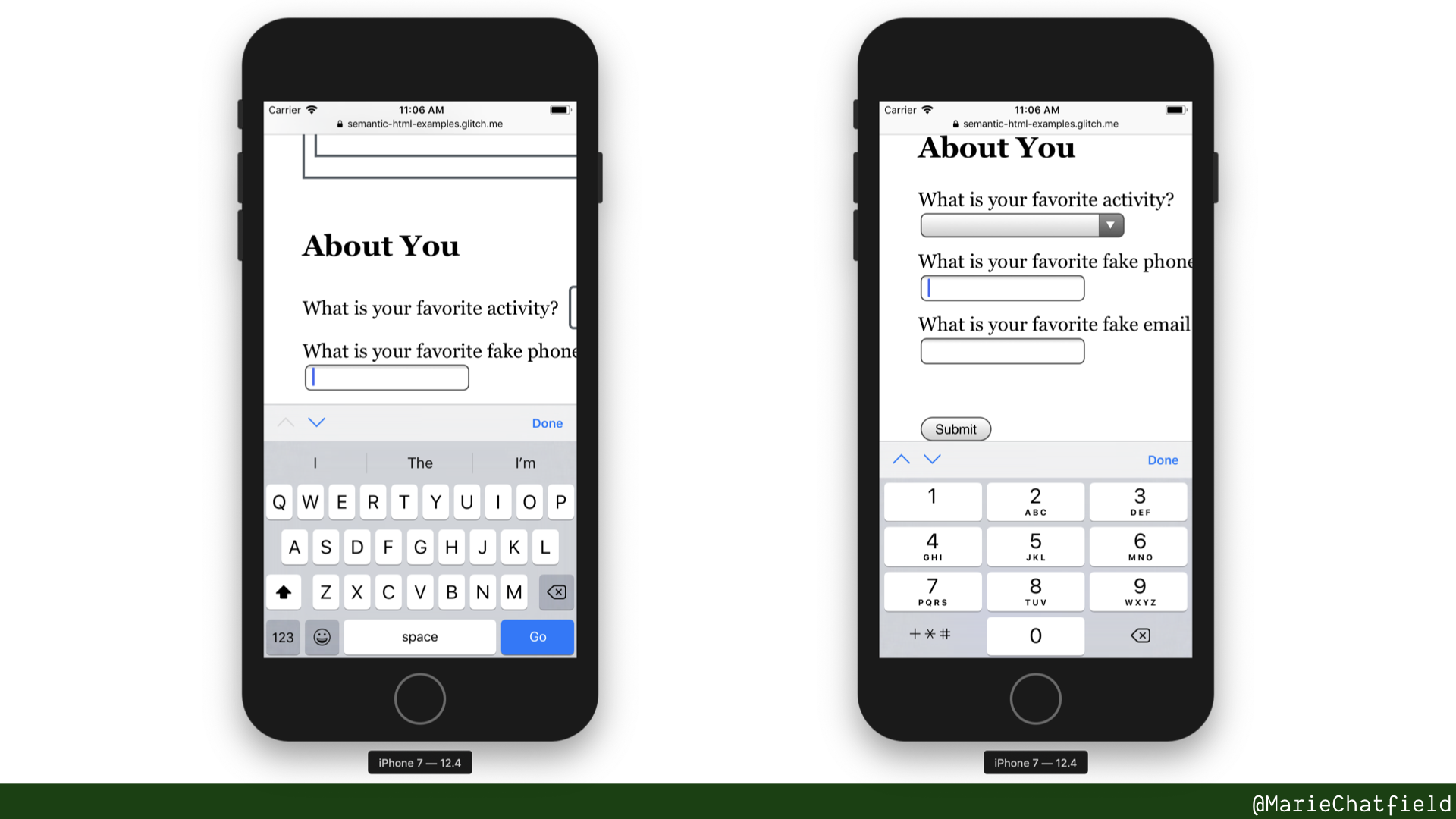
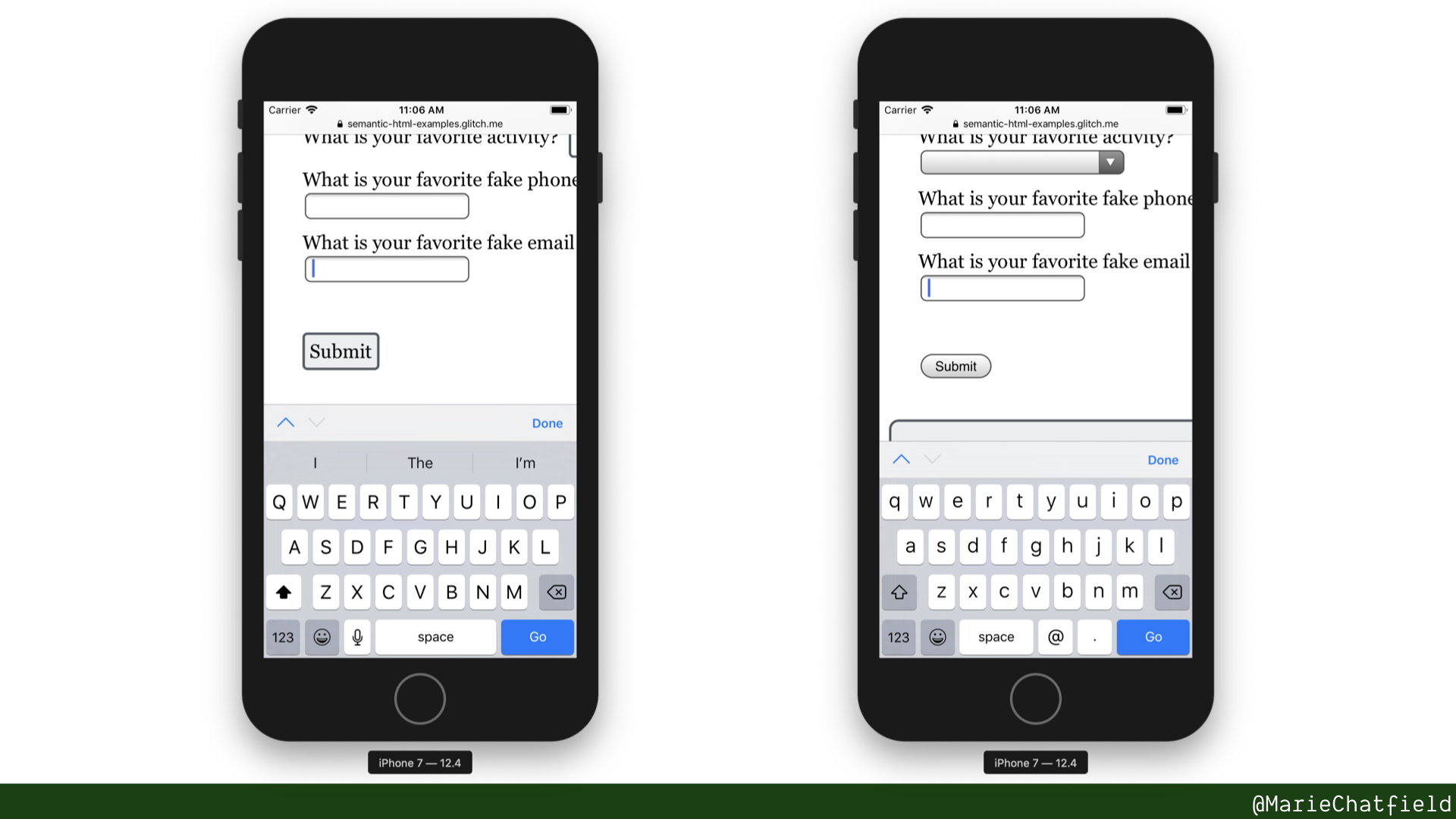
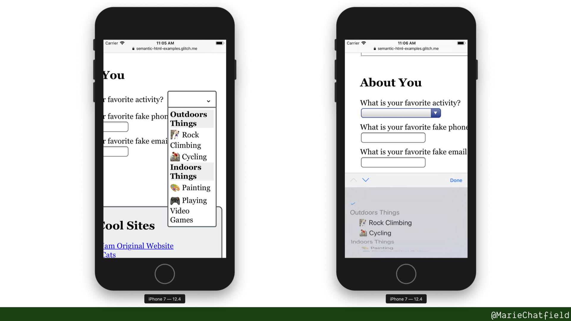
Here are the HTML elements that make up this page.
- <form>
- <fieldset> + <legend>
- <input> + <label>
- <input> types
- <select> + <options>
- <optgroup>
- <output>
General Resources
- Creating Accessible Forms, WebAIM
- Usability & Web Accessibility: Forms, Yale University
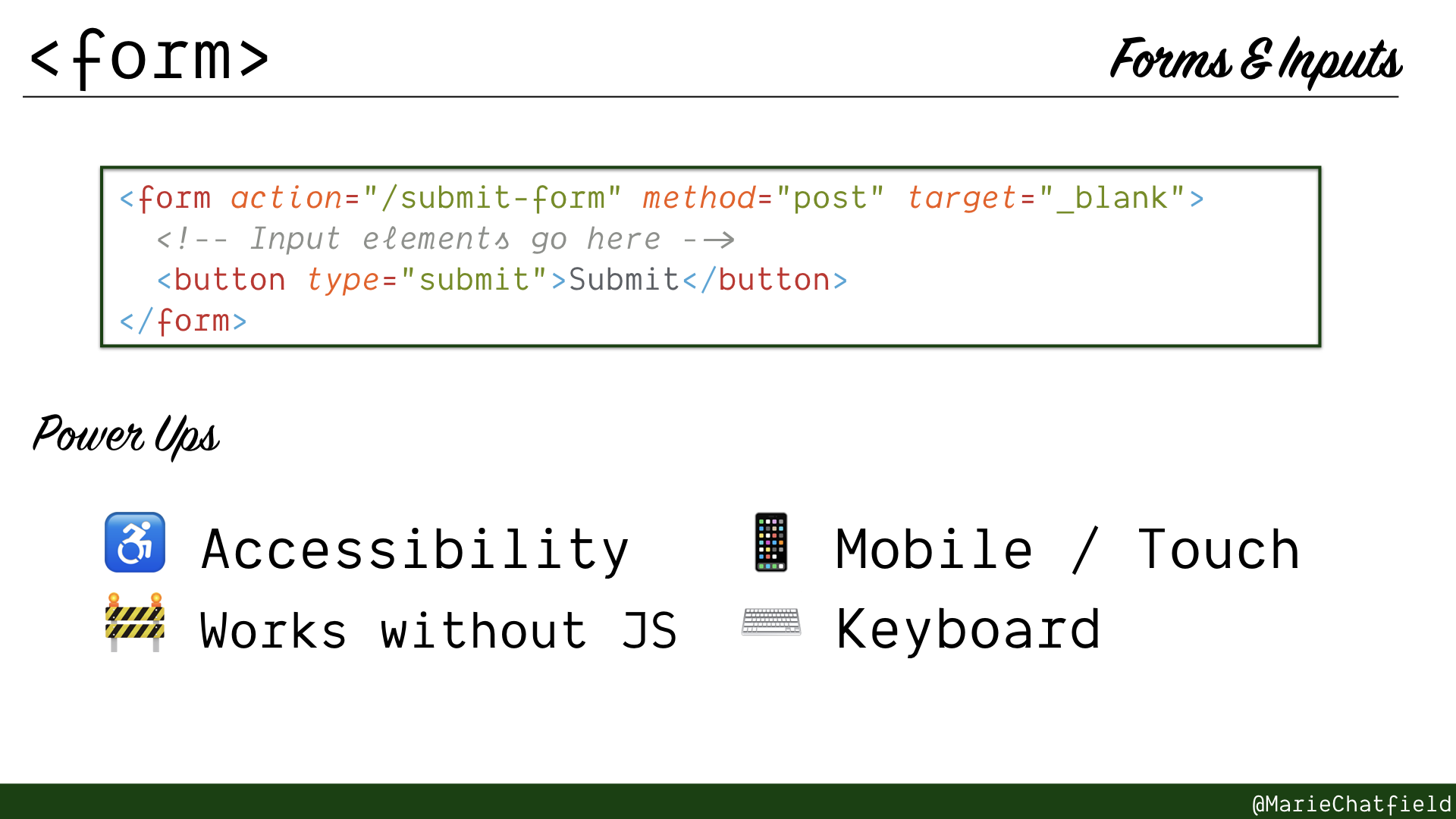
<form> element details slide, with code sample and power ups.
<form>
- Submittable, interactive controls and content
- Fires
submitevent when buttons are clicked or user hits “Enter” - Can make request with formatted input, without any JavaScript
Code Sample
<form action="/submit-form" method="post" target="_blank">
<!-- Input elements go here -->
<button type="submit">Submit</button>
</form>
Power Ups
- ♿ Accessibility
- 🚧 Works without JS
- 📱 Mobile / Touch
- ⌨️ Keyboard
Resources
- HTML Element: <form>, MDN
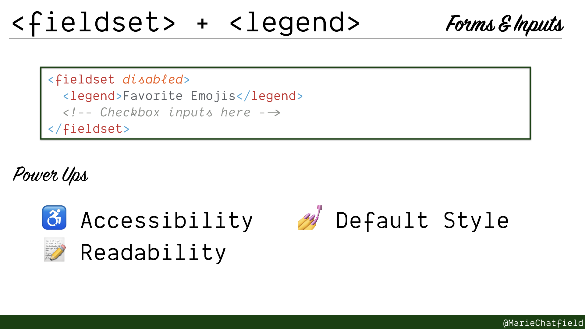
<fieldset> and <legend> elements details slide, with code sample and power ups.
<fieldset> + <legend>
- Group of related controls inside a form, with a caption
- Must have a <legend> caption as the first child - Most commonly used for checkboxes or radio inputs
Code Sample
<fieldset disabled>
  <legend>Favorite Emojis</legend>
  <!-- Checkbox inputs here -->
</fieldset>
Power Ups
- ♿ Accessibility
- 📝 Readability
- 💅 Default Style
Resources
- HTML Element: <fieldset>, MDN
- HTML Element: <legend>, MDN
- HTML5: The
fieldsetelement, W3C - Accessible Form Controls, WebAIM
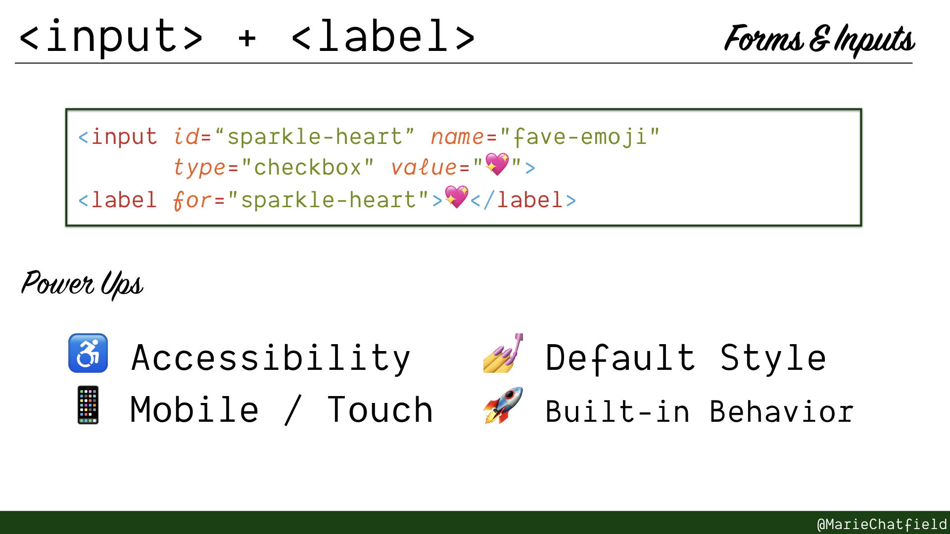
<input> and <label> elements details slide, with code sample and power ups.
<input> + <label>
- A single interactive control, with a caption
- Formats its data inside parent <form> using the “name” attribute
- Using HTML5 type attributes can give custom behavior
Code Sample
<input id="“sparkle-heart”" name="fave-emoji" type="checkbox" value="💖" />
<label for="sparkle-heart">💖</label>
Power Ups
- ♿ Accessibility
- 📱 Mobile / Touch
- 💅 Default Style
- 🚀 Built-in Behavior
Resources
- HTML Element: <input>, MDN
- HTML Element: <label>, MDN
- Accessible Form Controls, WebAIM
- Mobile Input Types, Jack Holmes
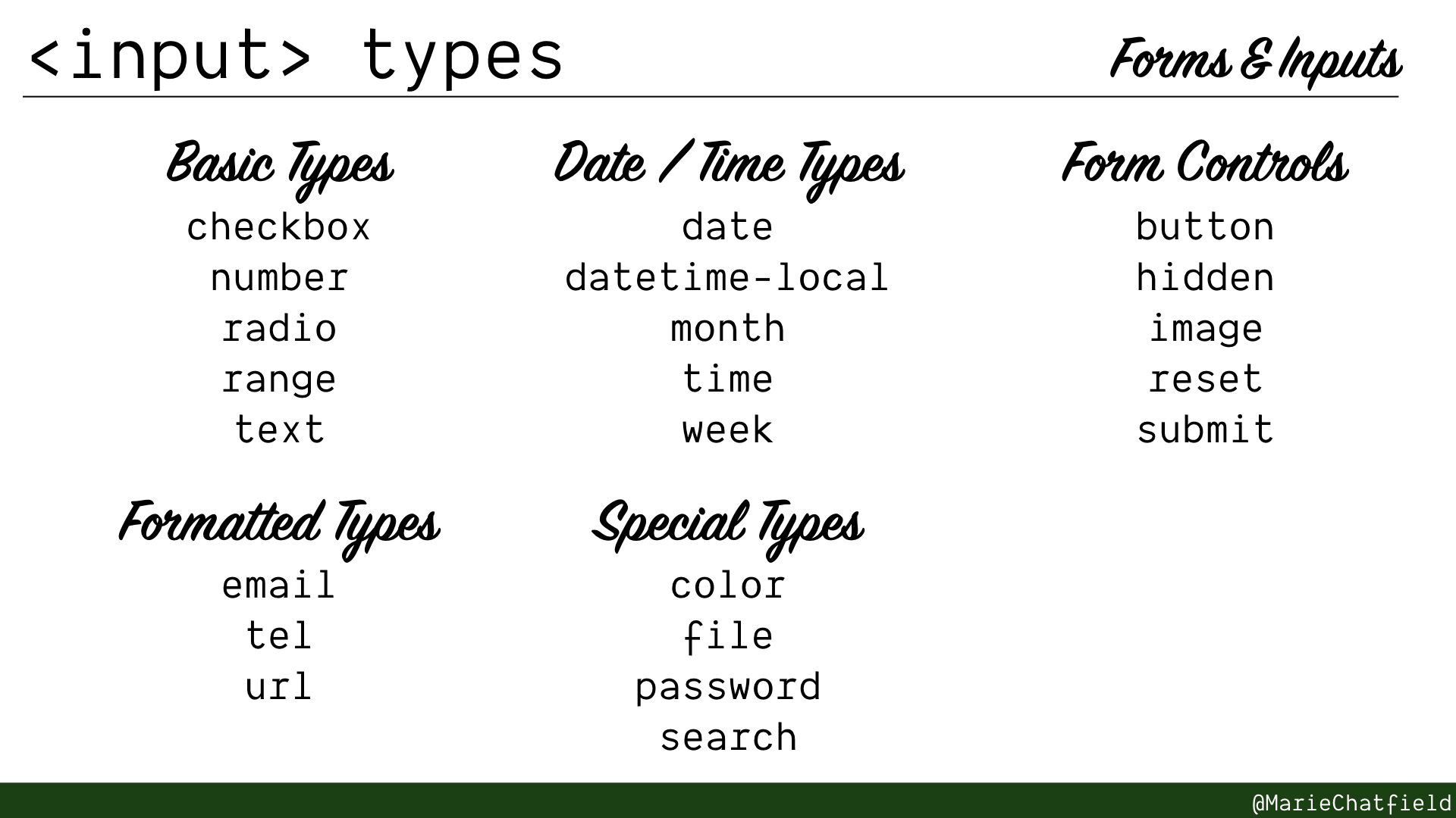
<input> type slides, split into Basic, Formatted, Date/Time, Special, and Form Controls categories.
<input> types
Warning: Inconsistent browser support, particularly for more complex types
Basic Types
- text, single-line text field
- checkbox, square tickbox
- radio, round tickbox
- number, single-line text with built-in validation for numeric types
- range, slider to specify a numeric value (inconsistent browser support)
Formatted Types
- email, single-line text with built-in validation for email addresses
- tel, single-line text for phone numbers (no validation, but will open special keyboard on mobile)
- url, single-line text with built-in validation for URLs
Date / Time Types
- date, day/month/year picker (inconsistent browser support)
- datetime-local, localized date and time (very inconsistent browser support)
- month, month/year picker (inconsistent browser support)
- time, hour/minute picker (inconsistent browser support)
- week, week/year picker (inconsistent browser support)
Special Types
- color, color code picker (inconsistent browser support)
- file, local file picker
- password, single-line text with obscured text and security controls
- search, single-line text for user-specified search
Form Controls
- button, renders a button (<button> element preferred)
- hidden, add data to form that is not accessible/available to users
- image, renders a graphical button (<button> element preferred)
- reset, renders a button that will clear all inputs to initial state
- submit, renders a button that will submit form on click (<button> element preferred)
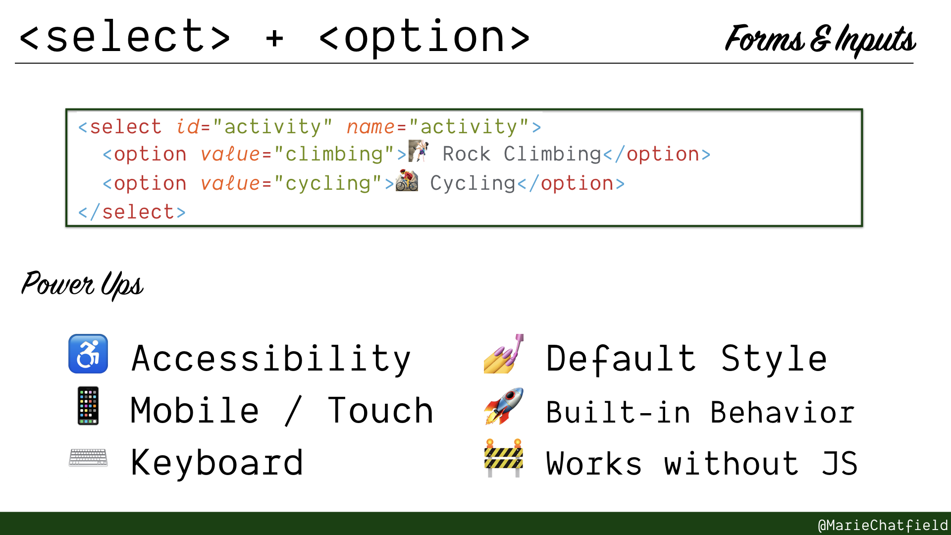
<select> and <option> elements details slide, with code sample and power ups.
<select> + <option>
- An input with a menu of options, a.k.a. a dropdown
- <option> can provide value attribute or use text inside
Code Sample
<select id="activity" name="activity">
<option value="climbing">🧗🏻♀️ Rock Climbing</option>
<option value="cycling">🚵♀️ Cycling</option>
</select>
Power Ups
- ♿ Accessibility
- 📱 Mobile / Touch
- ⌨️ Keyboard
- 💅 Default Style
- 🚀 Built-in Behavior
- 🚧 Works without JS
Resources
- HTML Element: <select>, MDN
- HTML Element: <option>, MDN
- Accessible Form Controls, WebAIM
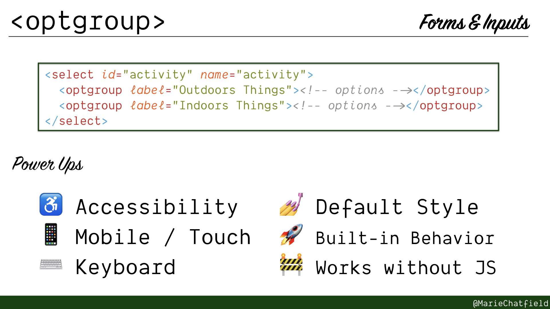
<optgroup> element details slide, with code sample and power ups.
<optgroup>
- An input with a menu of grouped options
- Displays labels at top of each group
- Prevents labels from being selected
Code Sample
<select id="activity" name="activity">
  <optgroup label="Outdoors Things"><!-- options --></optgroup>
  <optgroup label="Indoors Things"><!-- options --></optgroup>
</select>
Power Ups
- ♿ Accessibility
- 📱 Mobile / Touch
- ⌨️ Keyboard
- 💅 Default Style
- 🚀 Built-in Behavior
- 🚧 Works without JS
Resources
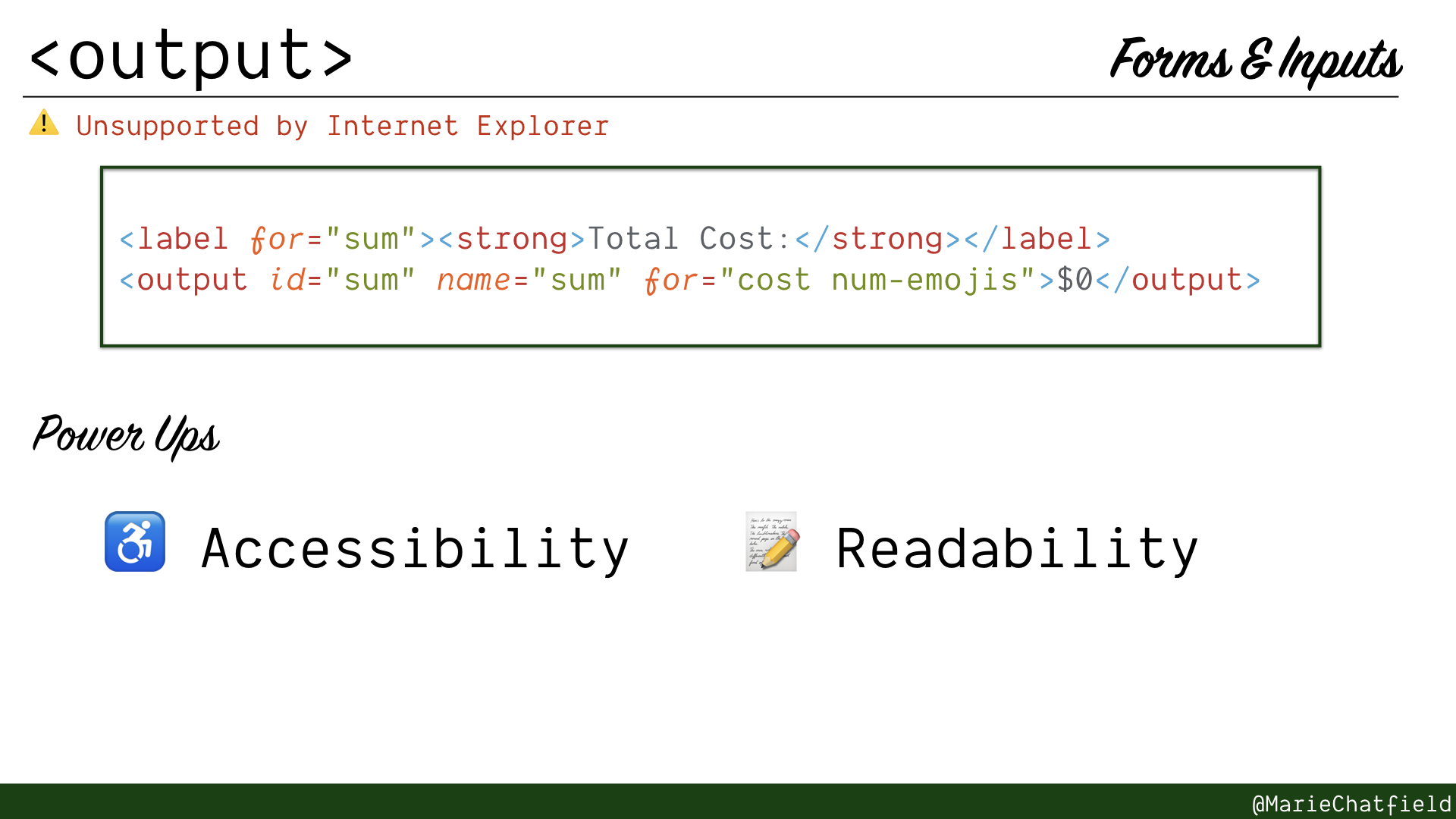
<output> element details slide, with code sample and power ups.
<output>
Warning: Unsupported by Internet Explorer
- Displays result or calculation from other form inputs - Update with JavaScript for re-computation on the fly
- Typically has
aria-liveattribute by default, which announces changes without moving focus
Code Sample
<label for="sum"><strong>Total Cost:</strong></label>
<output id="sum" name="sum" for="cost num-emojis">\$0</output>
Power Ups
- ♿ Accessibility
- 📝 Readability
Resources
Media & Figures
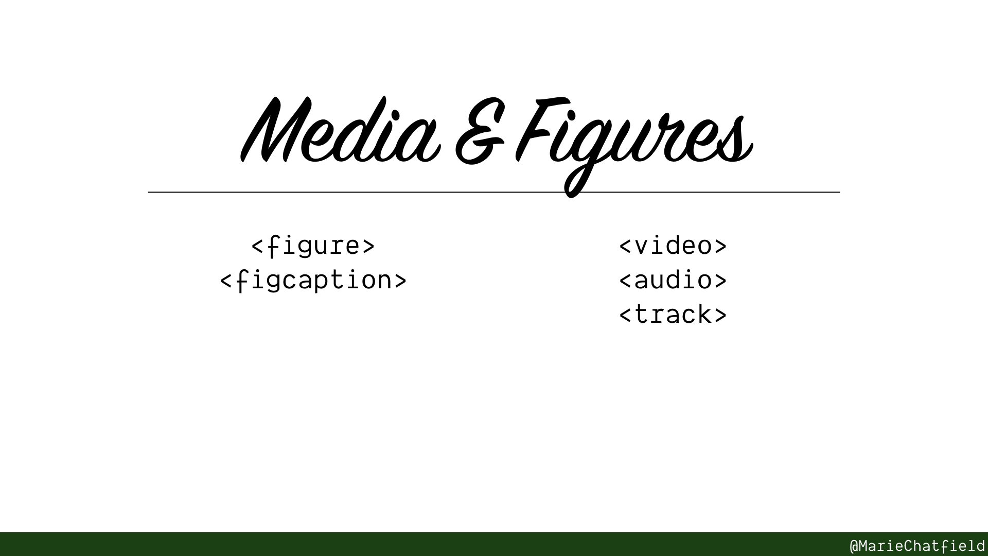
Media & Figures section slide, with HTML elements <figure>, <figcaption>, <video>, <audio>, and <track>.
Elements used to provide multimedia content or other visual/audio content and diagrams.
Improve accessibility and mobile experience. Use less code or external libraries.
Side by Side Preview
Let’s look at a sample page that has sample code implementations along with audio and video content, implemented using mostly <div> elements, and implemented using semantic HTML.
You can see the source code yourself, or edit a copy of it, using this Glitch app.
Let’s compare how these two sides stack up across a couple of different ways of accessing them.
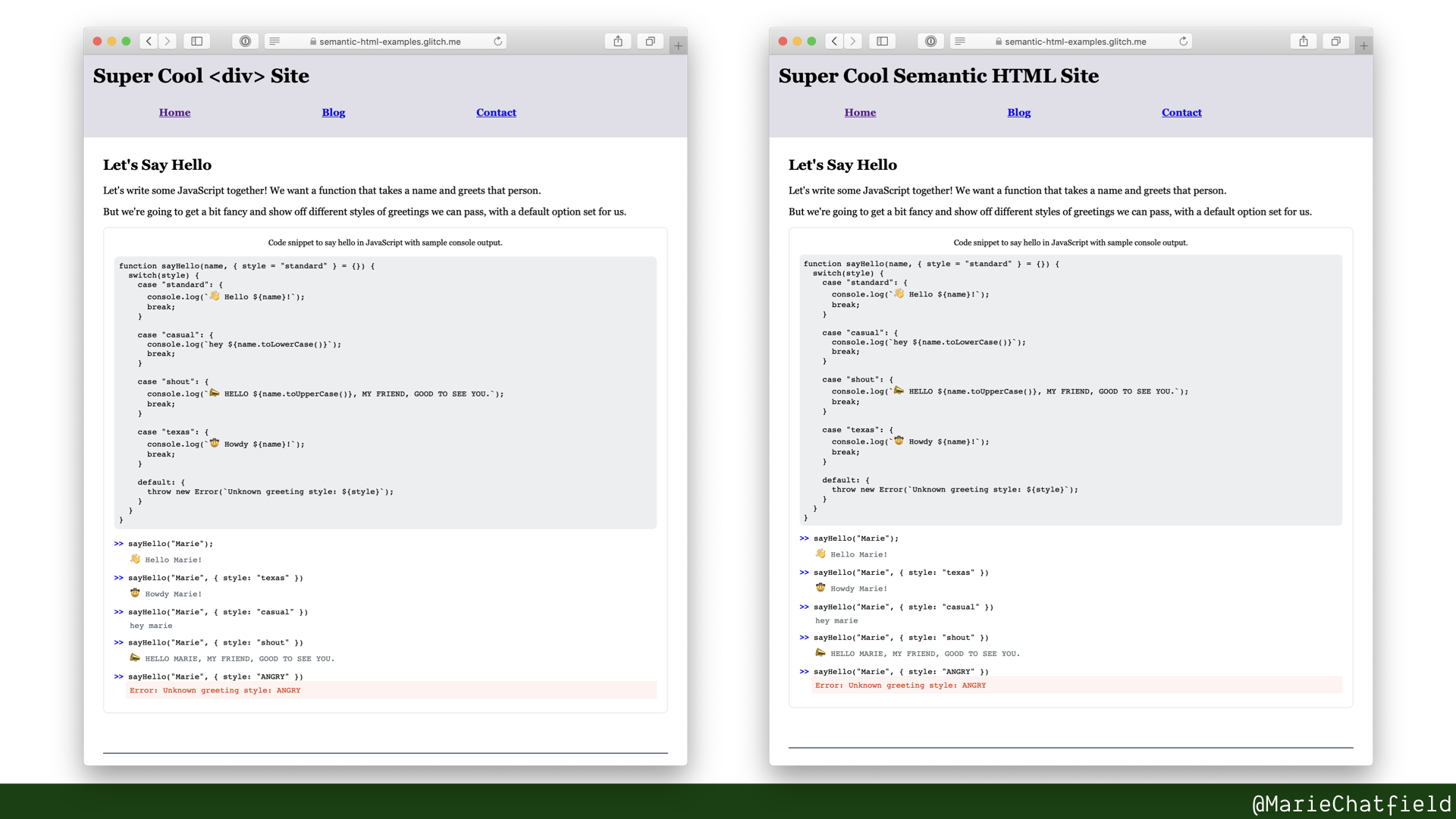
I didn’t bother trying to implement my own video player library, so for the <div> version, we do a hack where we use JavaScript to display out an iFrame with the URL to the video inside it.
This obviously does not work without JavaScript enabled. And neither would fancy JavaScript libraries.
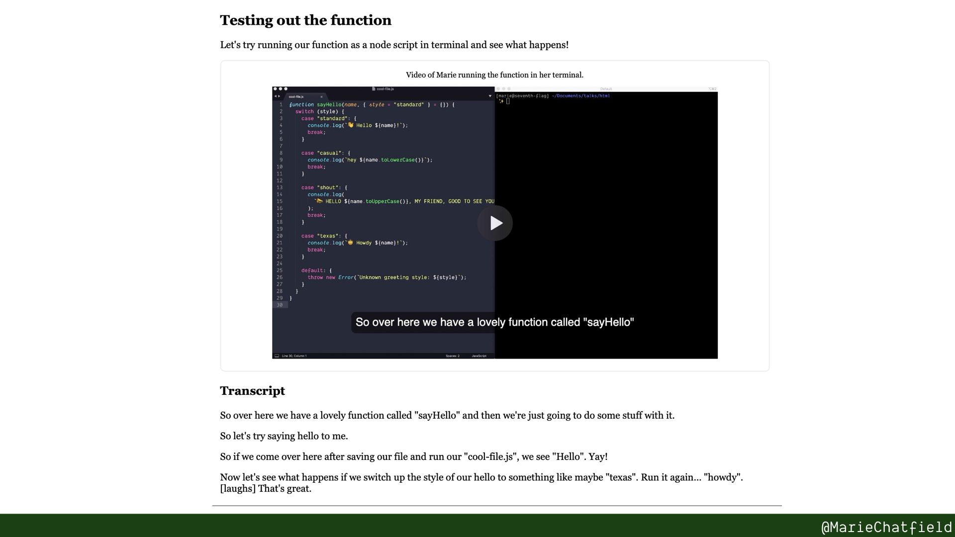
Here are the HTML elements that make up this page.
General Resources:
- Making Audio and Video Media Accessible, W3C WAI
- Provide an accessible media player, Harvard University
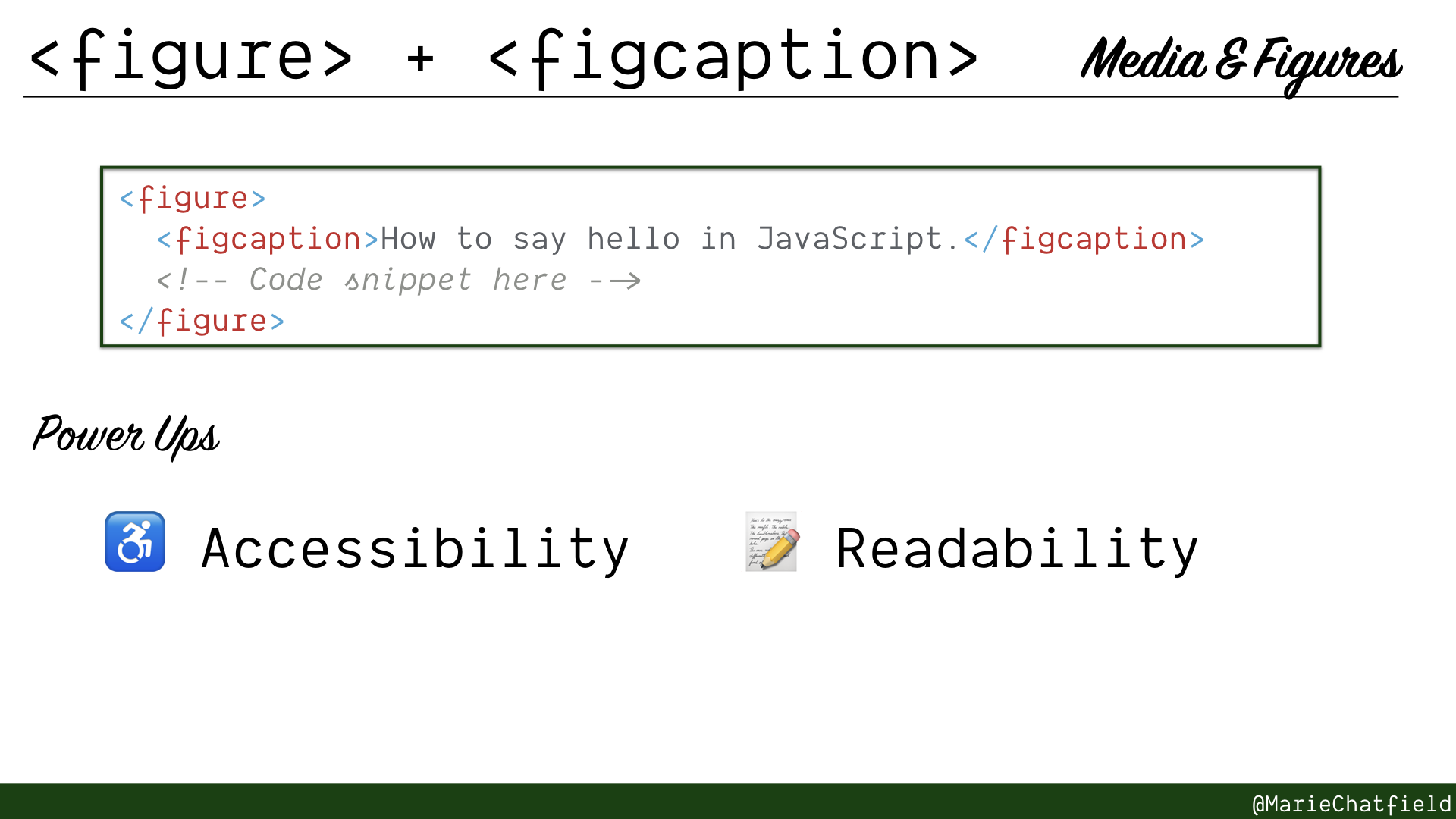
<figure> and <figcaption> elements details slide, with code sample and power ups.
<figure> + <figcaption>
- Self contained unit of content that is referenced by the main content
- Can contain illustrations, diagrams, video, audio, etc.
- Should have a <figcaption>, ideally before content
Code Sample
<figure>
  <figcaption>How to say hello in JavaScript.</figcaption>
  <!-- Code snippet here -->
</figure>
Power Ups
- ♿ Accessibility
- 📝 Readability
Resources
- HTML Element: <figure>, MDN
- HTML Element: <figcaption>, MDN
- HTML5 Accessibility Chops: the figure and figcaption elements, Steve Faulkner for The Paciello Group
- Note: published in 2011, before common browser support was implemented
- The figure & figcaption elements, Richard Clark for HTML5 Doctor
- See “Differences between <figure> and <aside>”
- Web Accessibility Tutorials: Complex images, W3C WAI
- Web Accessibility Tutorials: Groups of images, W3C WAI
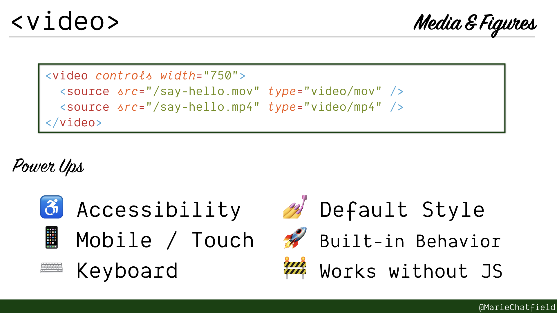
<video> elements details slide, with code sample and power ups.
<video>
- Embedded video player—no JavaScript needed!
- Displays controls to users in familiar, platform-consistent manner
- Can include multiple sources for different video types
- Should include captions/subtitles with <track>
Code Sample
<video controls width="750">
  <source src="/say-hello.mov" type="video/mov" />
  <source src="/say-hello.mp4" type="video/mp4" />
</video>
Power Ups
- ♿ Accessibility
- 📱 Mobile / Touch
- ⌨️ Keyboard
- 💅 Default Style
- 🚀 Built-in Behavior
- 🚧 Works without JS
Resources
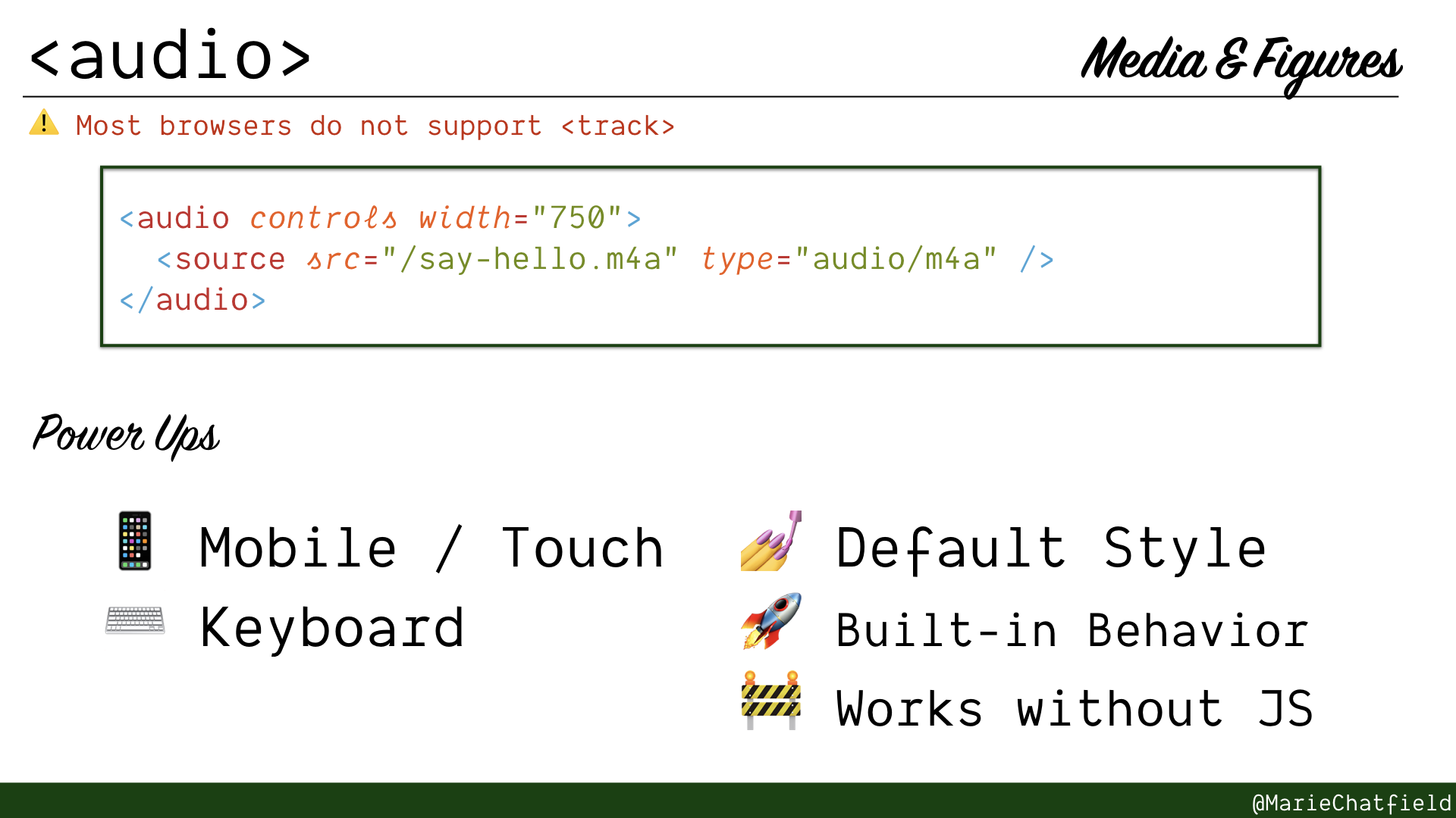
<audio> elements details slide, with code sample and power ups.
<audio>
- Embedded audio player—no JavaScript needed!
- Displays controls to users in familiar, platform-consistent manner
- Can include multiple sources for different audio types
- Can include captions with <track>, but appears unsupported in most browsers
Code Sample
<audio controls width="750">
  <source src="/say-hello.m4a" type="audio/m4a" />
</audio>
Power Ups
- 📱 Mobile / Touch
- ⌨️ Keyboard
- 💅 Default Style
- 🚀 Built-in Behavior
- 🚧 Works without JS
Resources
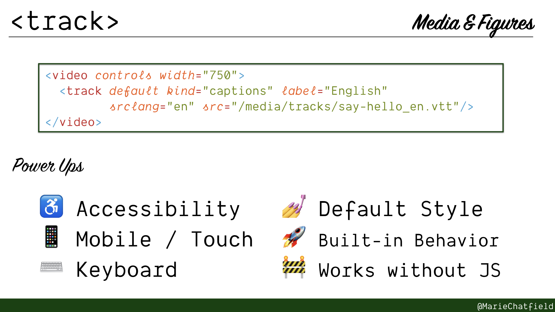
<track> elements details slide, with code sample and power ups.
<track>
- Add subtitles or captions to content
- Point to a WebVTT (.vtt) text formatted file
- Can specify multiple tracks with different labels for users to pick from
Code Sample
<video controls width="750">
  <track default kind="captions" label="English"
         srclang="en" src="/media/tracks/say-hello_en.vtt"/>
</video>
WEBVTT

00:00.000 --> 00:04.500
So over here we have a lovely function called "sayHello"

00:04.500 --> 00:07.000
and then we're just going to do some stuff with it.

00:07.500 --> 00:10.000
So let's try saying hello to me.

00:11.500 --> 00:15.000
WEBVTT

00:00.000 --> 00:04.500
Entonces, aquí tenemos una función agradable llamada <<saluda>>

00:04.500 --> 00:07.000
y vamos a hacer algunas cosas con ella.

00:07.500 --> 00:10.000
Entonces, tratemos de saludarme.

00:11.500 --> 00:15.000
Si venimos aquí después de guardar nuestro archivo
Power Ups
- ♿ Accessibility
- 📱 Mobile / Touch
- ⌨️ Keyboard
- 💅 Default Style
- 🚀 Built-in Behavior
- 🚧 Works without JS
Resources
- HTML Element: <track>, MDN
- WebVTT and Video Subtitles, Ian Devlin
- Note: published in 2011, before common browser support was implemented
- WebVTT and Audio, Ian Devlin
- Suggests workaround for audio captions by using <video> instead
Text Formatting
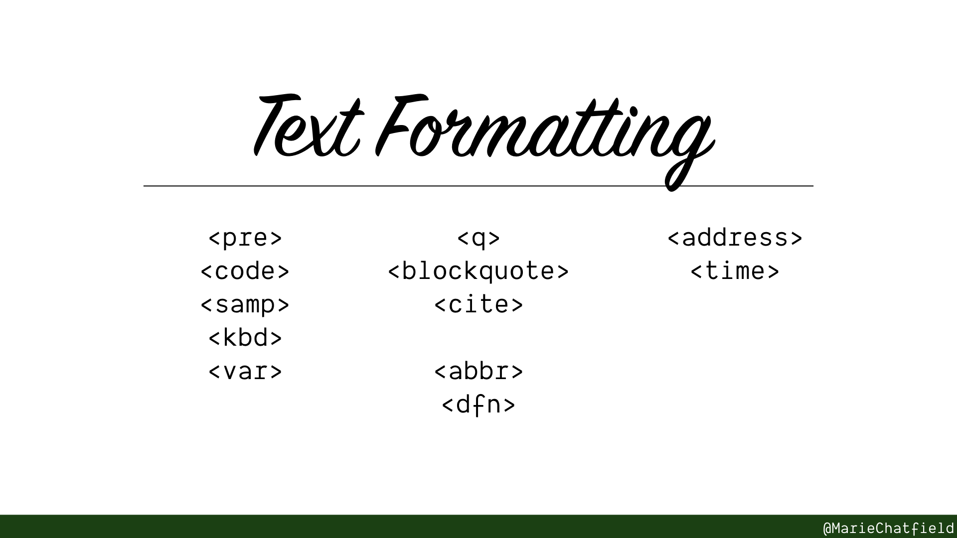
Text Formatting section slide, with HTML elements <pre>, <code>, <samp>, <kbd>, <var>, <q>, <blockquote>, <cite>, <abbr>, <dfn>, <address>, and <time>.
Elements used to encode special meaning or formatting for different types of text.
May improve SEO, or trigger browser-supported tools.
Programming Text
(Hint: check out the <figure> + <figcaption> sample app source code to see these in action!)
- <pre>: pre-formatted text, displayed in monospace font with white-space preserved
- <code>: text representing computer code, displayed in monospace font
- <samp>: text representing sample output from a computer program, commonly displayed in monospace font
- <kbd>: text representing user input on a keyboard / other device, commonly displayed in monospace font
- <var>: name of a variable in math or programming context, commonly displayed in italics
Quoted Text
- <q>: inline quotation, commonly surrounded in quotation marks
- <blockquote>: extended quotation, commonly displayed as indented
- <cite>: citation to a creative work, commonly displayed in italics
Terms and Definitions
- <abbr>: abbreviation or acronym, may display a tooltip with full description
- <dfn>: term being defined within the parent context, commonly displayed in italics
Data
- <address>: text representing contact information, in any preferred form; typically placed within a <footer>
- <time>: text representing time; may include machine-readable format for SEO or browser support for adding calendar events / reminders
Honorable Mentions
For the sake of time, I couldn’t include every single HTML element in the presentation. But here are a few other HTML elements that merit a mention in this longer form!
Lists
- <ol>: ordered list of elements, usually prefixed by a number
- <ul>: unordered list of elements, usually prefixed by a bullet or dash
- <li>: item in a list
Forms
- <progress>: a progress bar
- <textarea>: a multi-line text input
Tables
Note: It’s important to format tables well, to make them accessible for screen readers! For example, making sure headers are appropriately marked as such, so screen readers can announce the label for a particular cell.
- <table>: section of tabular data (rows and columns)
- <caption>: first element of <table>, designates the title or caption
- <thead>: container for rows that make up the head (e.g. headers)
- <tbody>: container for rows that make up the body of the table (e.g. main content)
- <tfoot>: container for rows that make up the footer of the table (e.g. summaries)
Rows and Cells:
Irregular and complex headers:
See Web Accessibility Tutorials: Tables with irregular headers, W3C WAI
- <colgroup>: a group of columns that are related, useful for complex headers
- <col>: a single column in a table, useful for complex headers
Typography
- <a>: an anchor, or link, to another page or location
- <br>: a line break
- <p>: a paragraph of text, usually separated by a blank line
Offset text:
- <sub>: a subscript, usually rendered in slightly smaller font below the rest of the text
- <sup>: a superscript, usually rendered in slightly smaller font above the rest of the text
- <small>: small print, such as legal text (prefer to use CSS if difference is merely visual)
Emphasized or italicized text:
Note: many of these look very similar, but have different meanings. Pay attention to the nuances!
- <strong>: text of strong importance or urgency, usually rendered with bold type
- See <b> vs <strong>
- See <em> vs <strong>
- <b>: text in bold type
- See Usage notes for discussion of <b> vs <strong> vs <em>
- <em>: emphasized text, usually rendered in italic font
- See <i> vs <em>
- <i>: text that is set off from normal prose, usually rendered in italics (e.g. a proper name or a term in another language)
- See <i> vs <em>
Text Revisions:
- <mark>: marked or highlighted text
- <s>: text with a strikethrough, or line (to indicate it is no longer relevant)
- <ins>: text that has been inserted
- <del>: text that has been deleted
Summary
Slide with title “Takeaways” and subtitle “Resources & important points to remember”
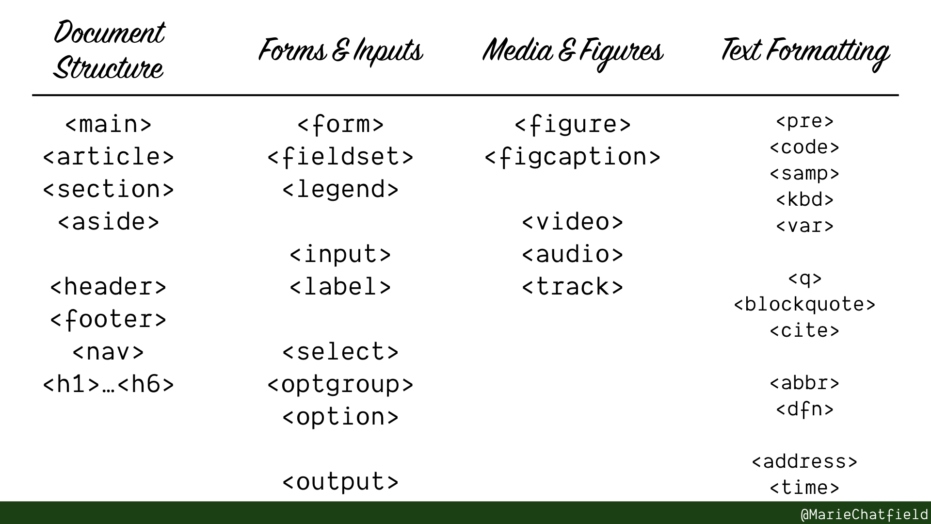
Slide with list of all HTML elements in the different major sections covered above.
That’s a lot of content! Let’s review the important points:
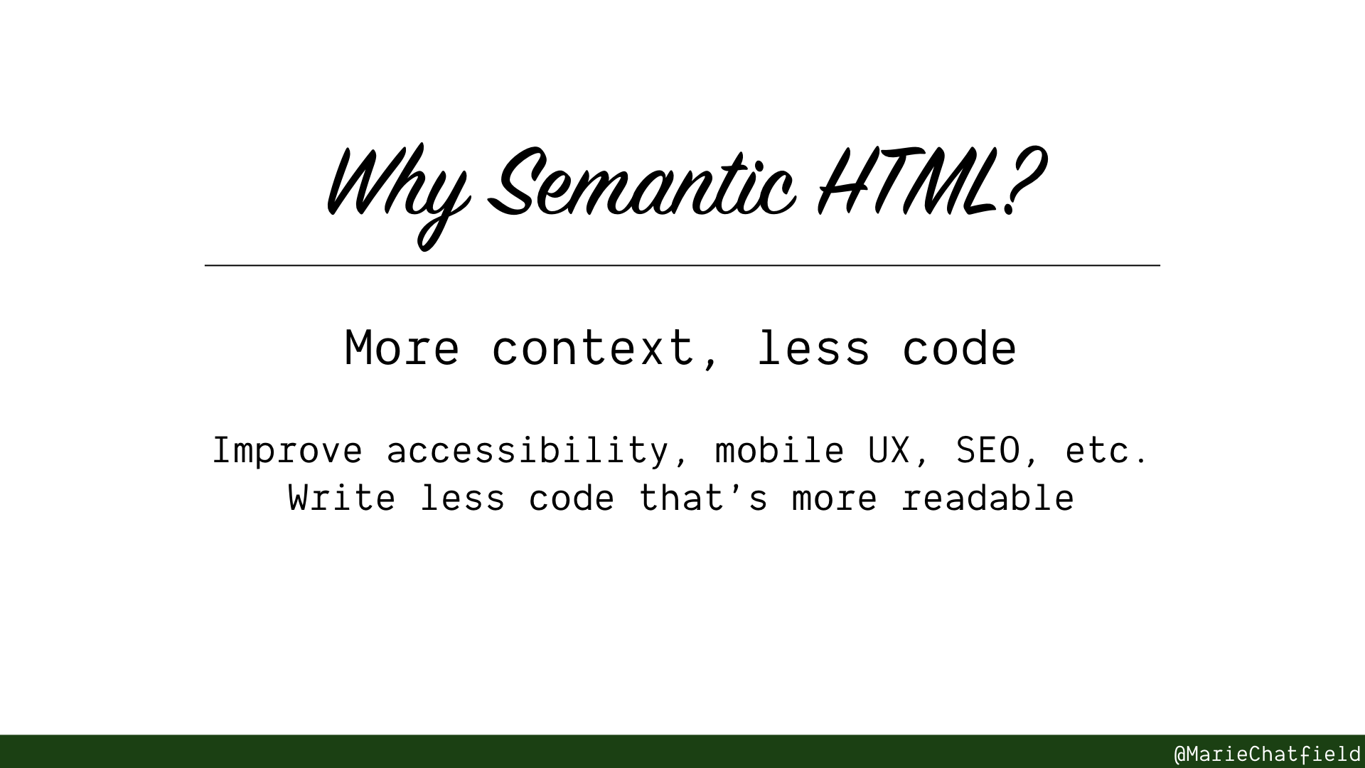
Semantic HTML gives more context with less code.
Semantic HTML gives more context with less code. That means you can improve accessibility, mobile UX, SEO and more… while writing less code that’s more readable.

Gif of Paramore concert with lyrics “You are the only exception” overlaid on top of sparkling lights. (source)
But for every rule, there’s an exception so… when shouldn’t you use semantic HTML?
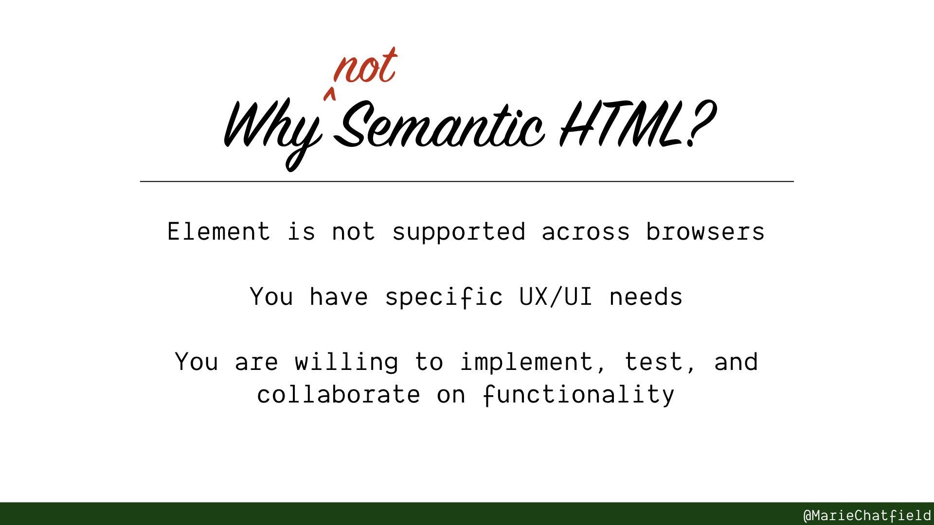
Not every use case will work with the basic semantic HTML elements.
Not all HTML elements are supported across all browsers, or they might have inconsistent behavior in a way that matters to you.
Sometimes you are going to have a very specific use case or design need that can’t budge.
It’s okay to write your own versions instead of using semantic HTML, but you need to understand what the browser implements for you and be willing to write it yourself, test, and maintain it.
It is strongly suggested you use an existing open source library where multiple users can support patches and ensure it works broadly and consistently across browsers.
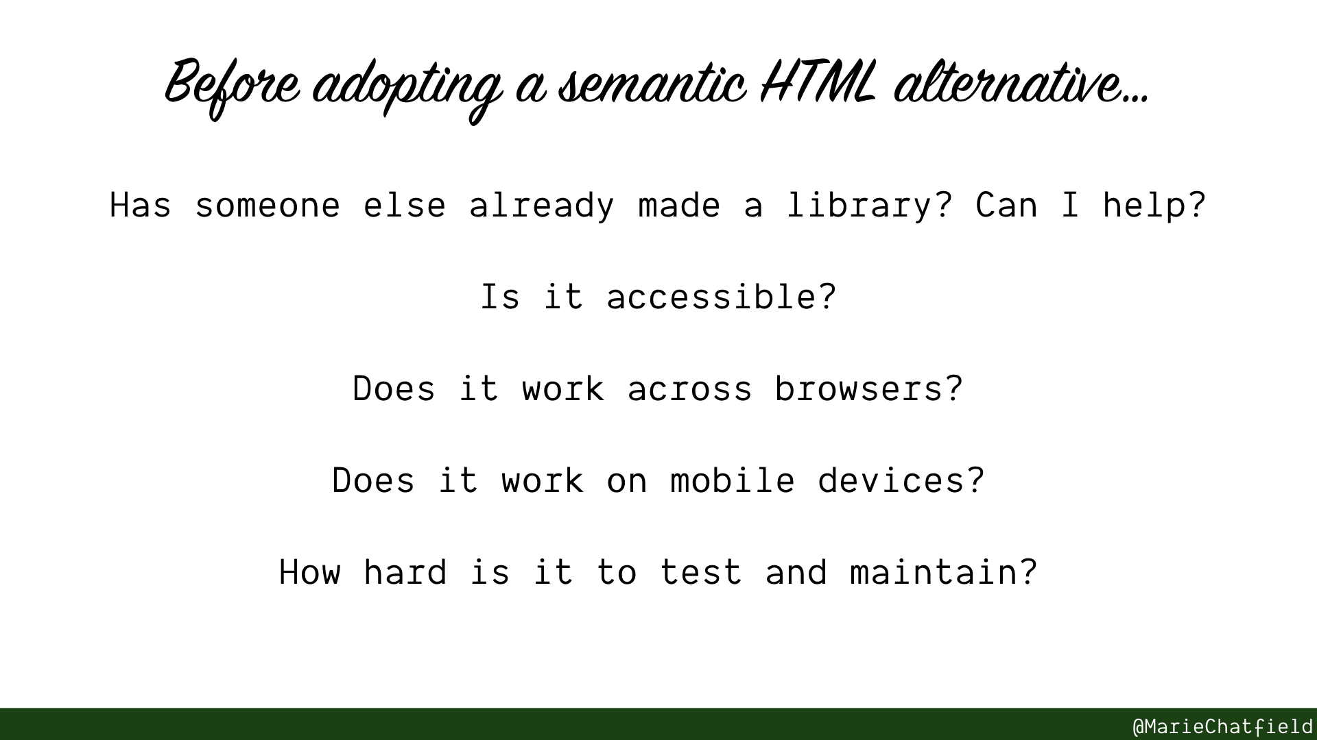
But if you aren’t going to use semantic HTML elements, make sure you’re ready to take on the work yourself or support it.
If you are going to adopt a custom version of one of these elements (even more so if you’re going to write one yourself), be sure to consider:
- Has someone else already made a library? Can I help?
- Is it accessible?
- Does it work across browsers?
- Does it work on mobile devices?
- How hard is it to test and maintain?
Gif of School House Rock cartoon with children smiling and one says “Knowledge is Power” (source)
Now that you know:
- that all of these HTML elements exist;
- what they do;
- and what power ups the browser provides for each one
you can make informed decisions about when to use these elements to write semantic HTML… or when your use case calls for a custom implementation, and precisely why the existing elements won’t work.
Use your knowledge for great good, and make beautiful and accessible websites for all! 🎉
Additional Resources
Accessibility / Assistive Tech
- Designing for Screen Reader Compatibility, WebAIM
- Article about how screen readers are used to interact with websites, and how to build websites with them in mind
- Functional Accessibility Evaluator Rulesets, University of Illinois
- List of rulesets based on the WCAG guidelines for building accessible websites
- HTML5 Accessibility, Steve Faulkner
- Current accessibility support status of HTML5 features across major browsers
- VoiceOver User Guide, Apple
- Overview from Apple about how to use the VoiceOver screenreader
- Appendix A. Commands and Gestures, Apple
- Appendix of VoiceOver commands and gestures, a good quick reference
Semantic HTML
- Glossary: Semantics, MDN
- Definition of semantics with respect to JavaScript, CSS, and HTML
- Nu HTML Checker, W3
- Experimental tool to validate markup and catch unintended mistakes
Did you like this post? I’ll be sporadically publishing more content like this to the git checkout -b idk-what-im-doing blog in the future! Tweet me @mariechatfield to let me know what kind of resources you’d like to see next.
🙏🏻 Many thanks to my team at Pingboard for supporting my time writing these posts, and to the EmberCamp organizers for providing the first space for this talk to happen!
Interested in seeing this talk come to a stage near you? Contact me!
A whimsical introduction to how computers talk to each other, and what exactly your requests are up to.
From onboarding to coaching, give your interns the tools they need to succeed—and set up your reports to lead them.